
Redesign of Surty's
E-commerce webpages
June '19
| Organization | Squad | Role |
| Freelance job | Independent | UX/UI Designer |
June '19
| Organization | Squad | Role |
| Freelance job | Independent | UX/UI Designer |
Fitness fashion and sportswear customers.
Highly satisfied and positive feedback from the client in this endeavor.
This was one of the main projects I worked on as a freelance UX/UI Designer, and it was the first time I had the opportunity to work on all the pages of an e-commerce website. I collaborated with Diego Lucas on this project.
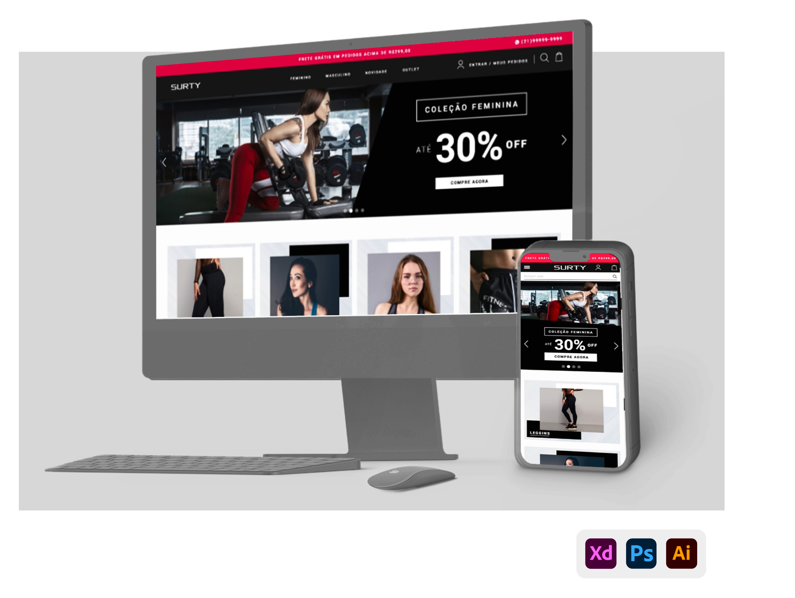
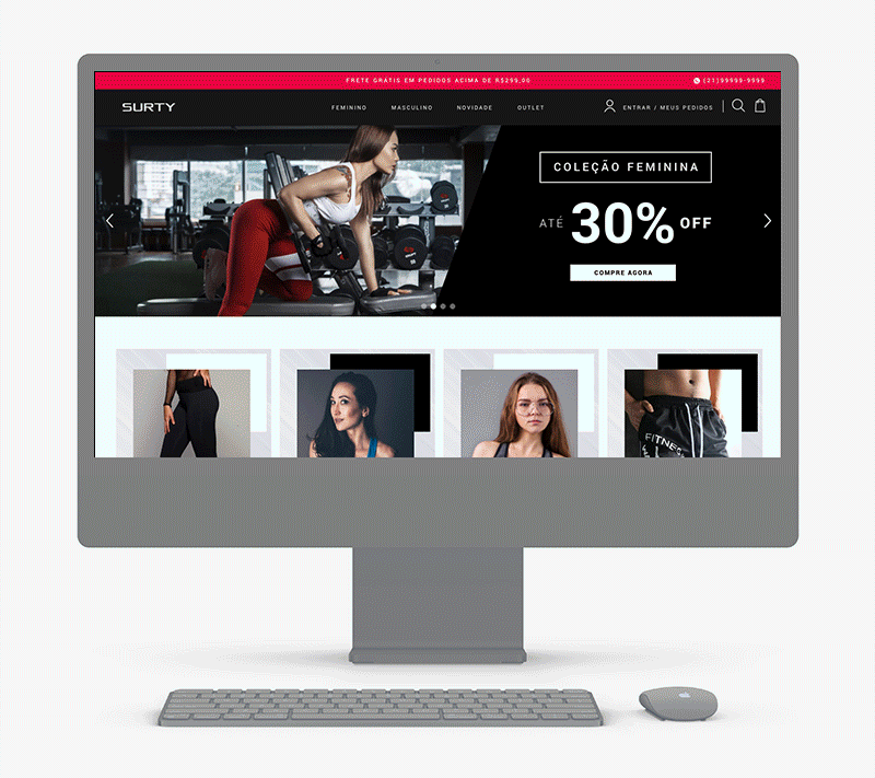
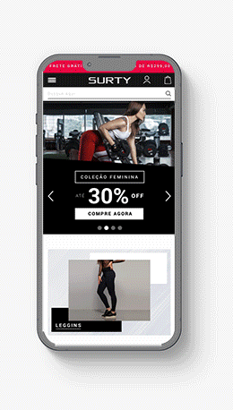
Surty is an E-commerce platform specializing in sportswear, fitness, and running clothes. I was responsible for a complete redesign of the website, catering to both desktop and mobile versions.
The primary goal of this project was to revamp all the screens of the e-commerce platform, as the visual design was outdated. A significant challenge was to enhance the entire user journey of the website, from the homepage to the checkout process. Given the project's defined timeline, I would like to highlight the usability analysis conducted on the old layout, in order to make the necessary changes.
This project required me to align all the client's needs for implementation in the redesign. I studied the references provided by the client and proposed new ones, all of which underwent validation stages with the client before arriving at the final result.
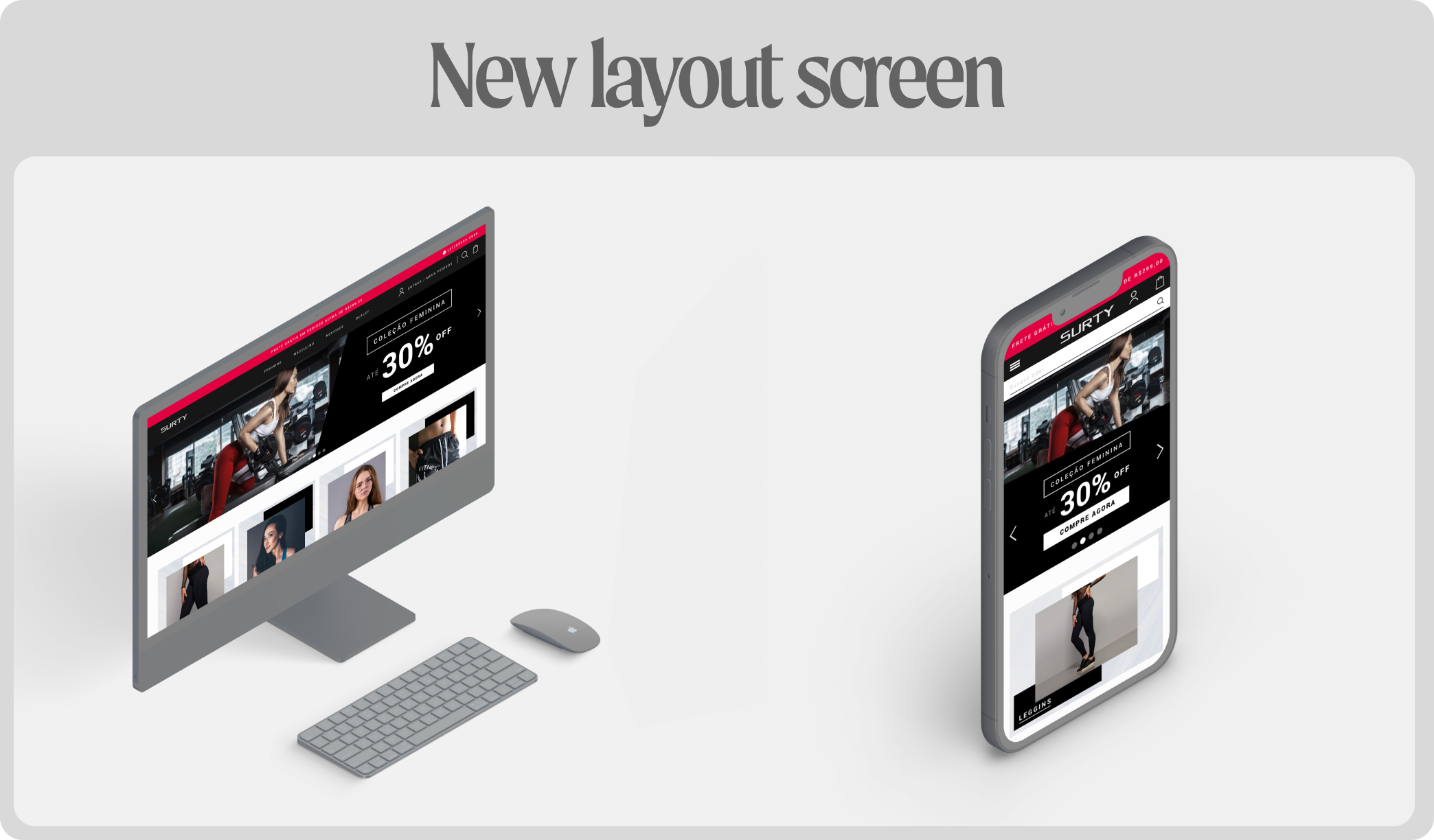
Starting with the homepage, the text in the search field, felt a bit tiring, so I opted for more straightforward wording. The cart icon wasn't aligning with the site's visual identity; it had slightly rounded edges, while the rest of the site featured pointed edges. It was tilted, whereas other visual elements were at right angles. Additionally, it appeared pixelated. So, not only did it require replacing to match the visual identity, but instead of a cart, I introduced a shopping bag as it better symbolizes clothing stores.
The header wasn't fixed on mobile, and on desktop, it lacked an aesthetically pleasing appearance. It was too thin and had a white outline. It needed to be adjusted and standardized for both formats. In this regard, I worked on a revamp, introducing visually appealing aspects and dding aditional changes, such as 'My Orders' item.
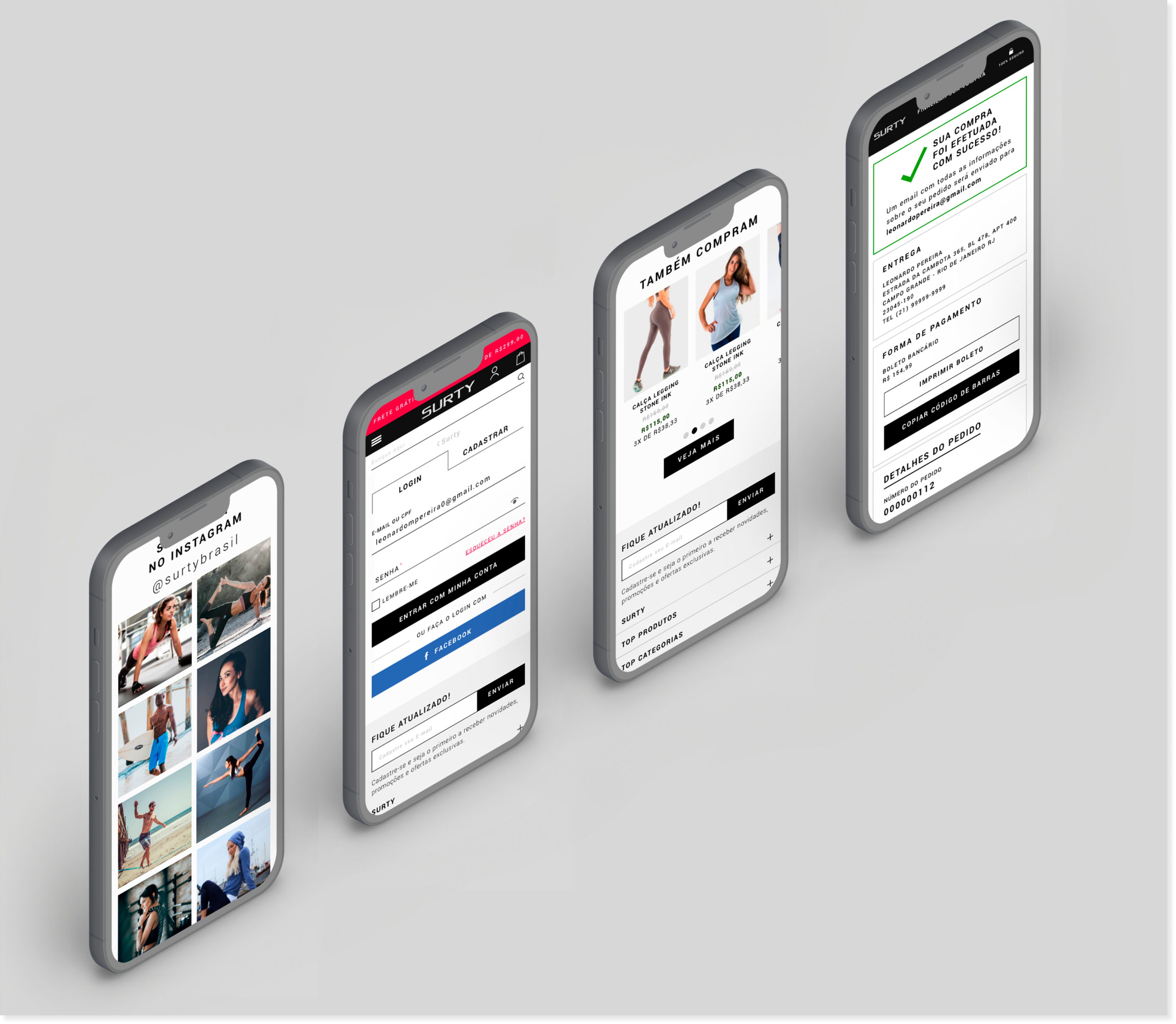
Note: additionally, the client's requests included a top banner with 'Free Shipping' and WhatsApp details, new categories. There was a need for an Instagram section with prominence to attract new followers. The overall site was meant to be beautiful and appealing.

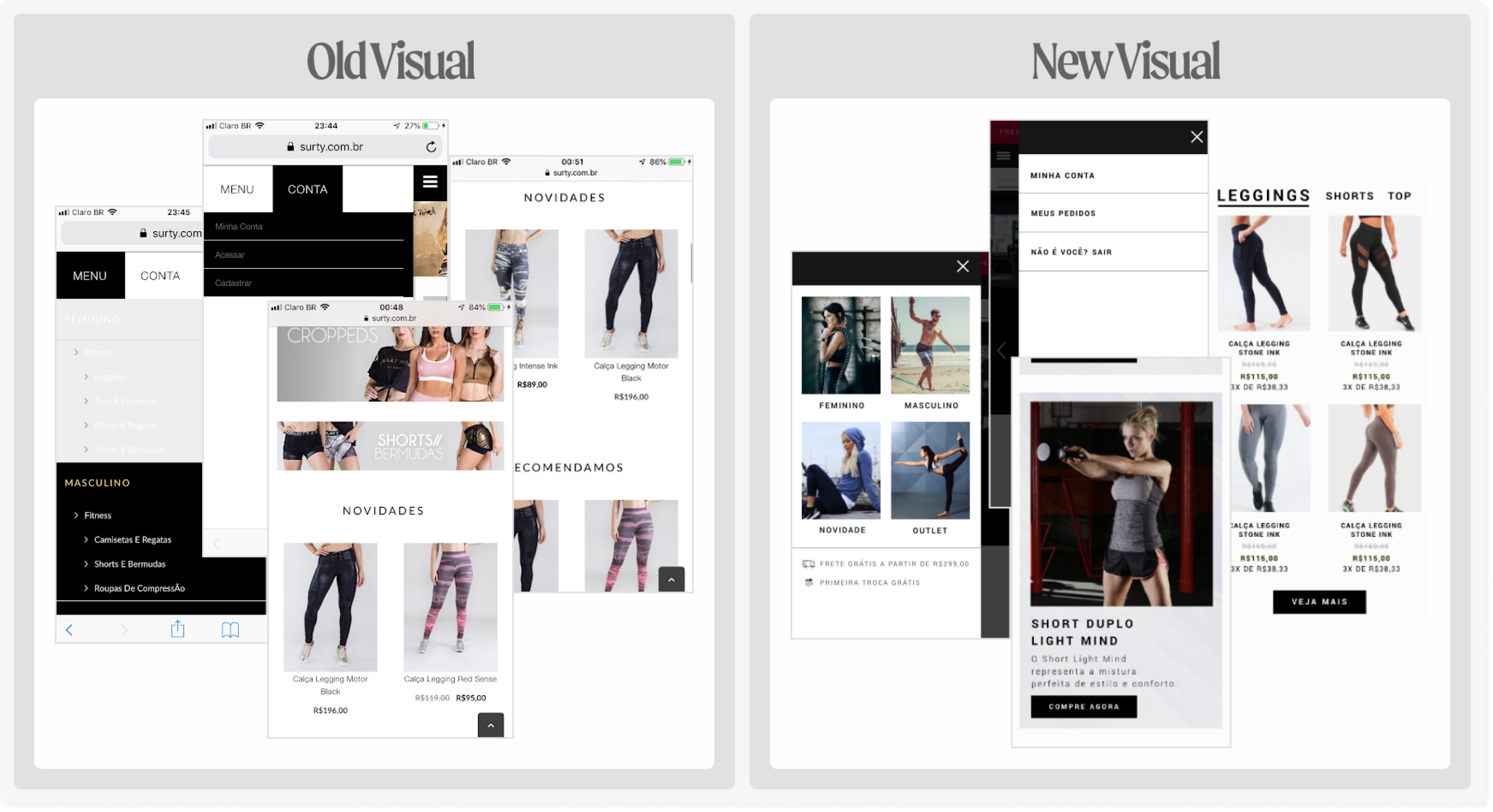
The open menu on mobile had very poor usability, as both the "menu" and "account" tabs were not clear as tabs, given that the "account" section is much larger. The chosen colors were not suitable, as clicking on one item would make the other turn white, which was bothersome for users. The arrows before each name mistakenly implied that there would be another sub-level within that option. Therefore, I restructured it, placing the categories on the left side, and as it's a fashion site, I made the categories more visual. On the right side, I placed the "my account" and "my orders" sections, making the divisions clearer.
The large desktop banner and the very small mobile banner weren't consistent, and the mobile version didn't respect the same property as the desktop. Hence, I needed to work on this responsiveness. The visual appearance of the categories needed to be revisited to make it more aesthetically pleasing, and also because it didn't respect the desktop's property, resulting in whitespace gaps between them. The product calls to action, apart from the overall font issue, appeared too discreet on mobile, positioned far from the images, hindering user comprehension that they are related.
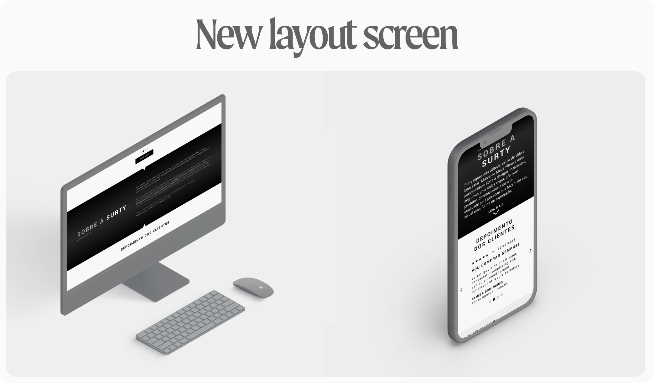
In the description section about SURTY, there wasn't a proper balance of information weight. The box was disproportionately more prominent than the content itself, which is the relevant information. On mobile, the left-right alignment didn't work well, and it could have been aligned to the left consistently. It didn't make sense for the callout to be on the left for desktop and on the right for mobile, and the font size was not optimal, affecting legibility. As a result, I worked on a new layout design that was more stylized to better match the brand and adapt better to SEO aspects.
I didn't see the need for a 'back to top' button on the home page for mobile, as the page wasn't very long, and it cluttered the home page's visual appearance. This will be resolved with the fixed menu, as users will be able to access the main options while navigating. Additionally, the home page is intended to be aesthetically appealing.
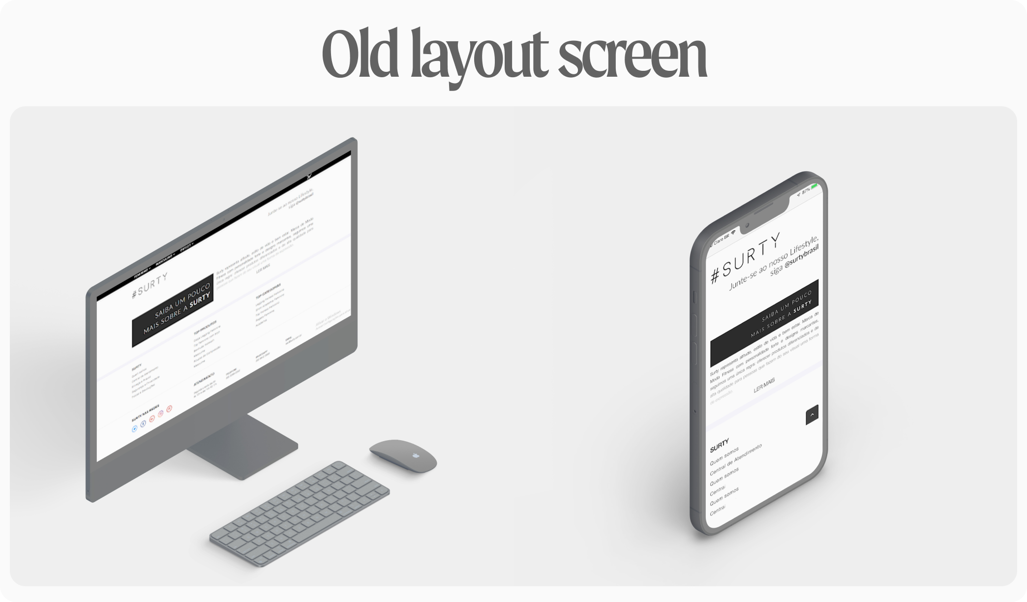
The footer needed a complete overhaul in both desktop and mobile formats. The elements were not well organized, the social media logos weren't attractive, and the footer block was too large, occupying an entire standard screen on desktop and requiring approximately two and a half scrolls on mobile. I worked on all these adjustments to enhance the user experience.
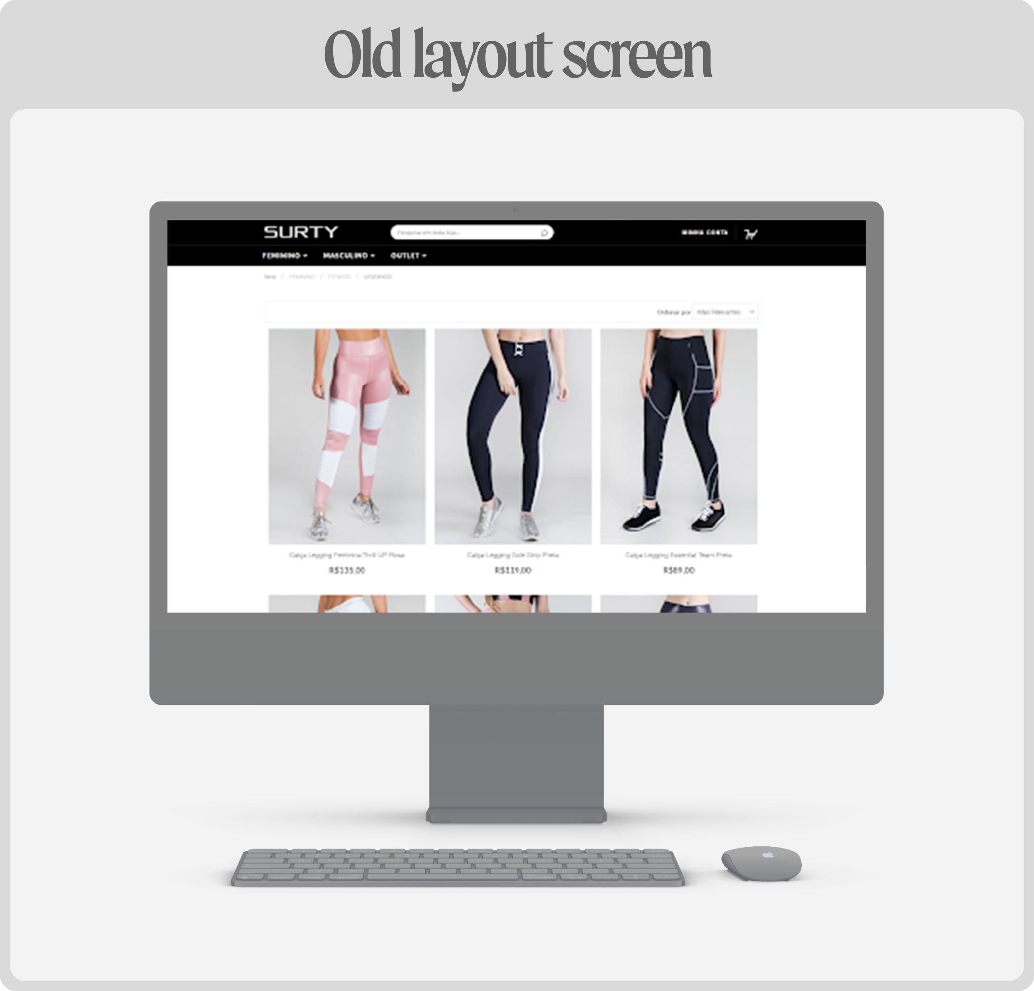
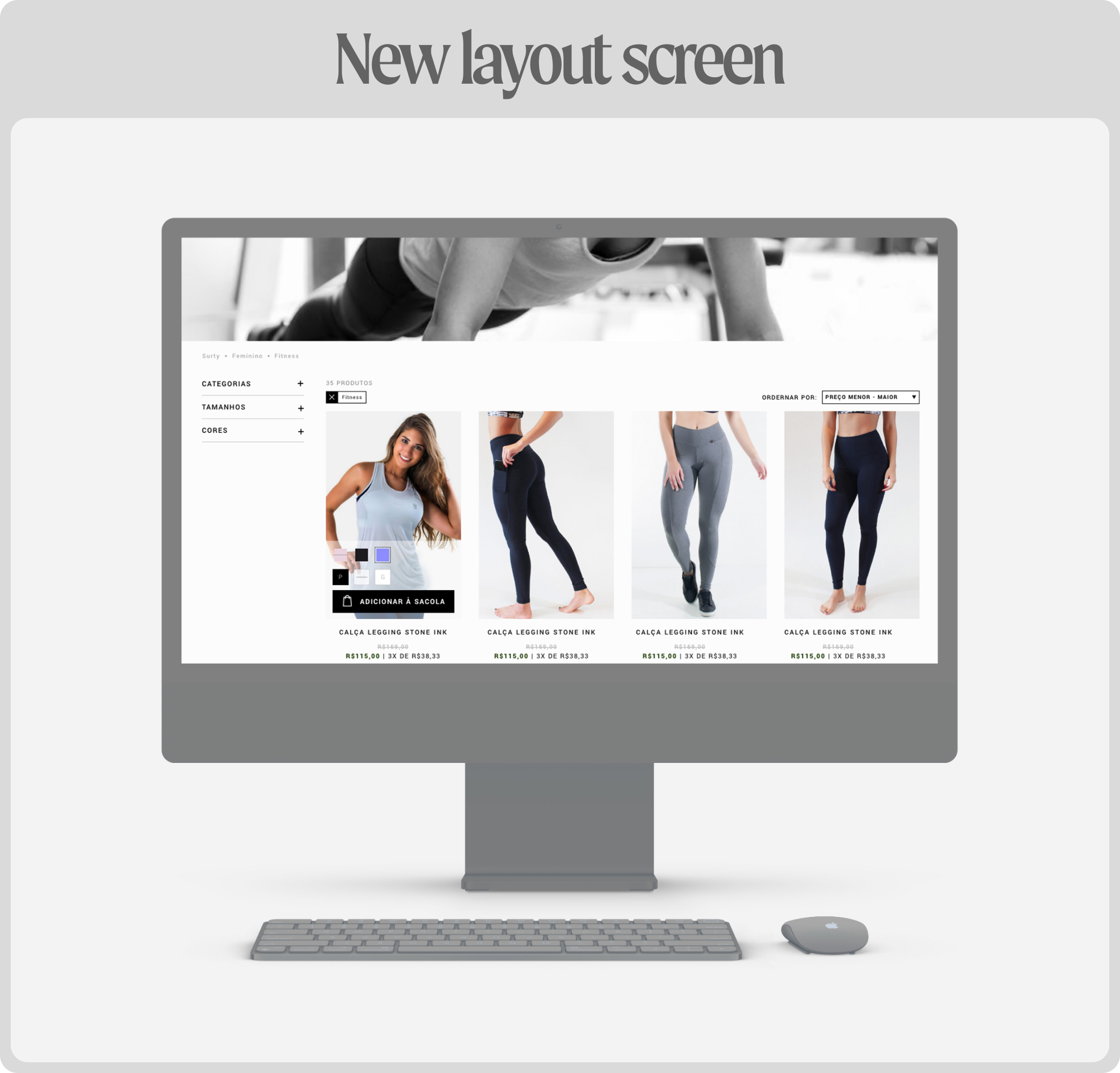
In terms of the catalog page, there was a need to have filters for size and color. The size filter prevents users from getting frustrated if they click on a clothing item and then discover that their size isn't available. Additionally, the color filter is important because sometimes users have a specific product in mind. Alongside this, adjustments were made to sizes, spacing, insertion of old/current price information, installment details (which is crucial for the Brazilian audience), as well as refining the 'Add to Cart (bag)' button. All these modifications were necessary as the page lacked both content and aesthetic appeal. I also added a carousel displaying 'Others Also Bought' to boost sales.
Note: meeting the client's requests, I integrated options for 'lowest price,' 'highest price,' 'bestsellers,' and 'top ratings' for sorting. I also incorporated category-specific text for SEO purposes.
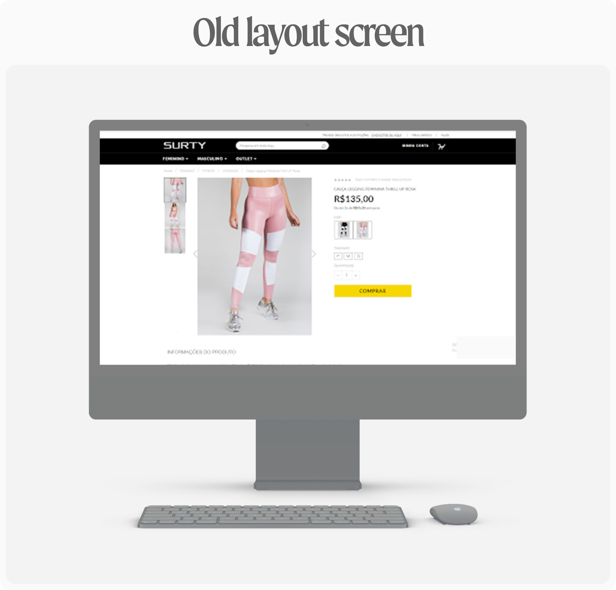
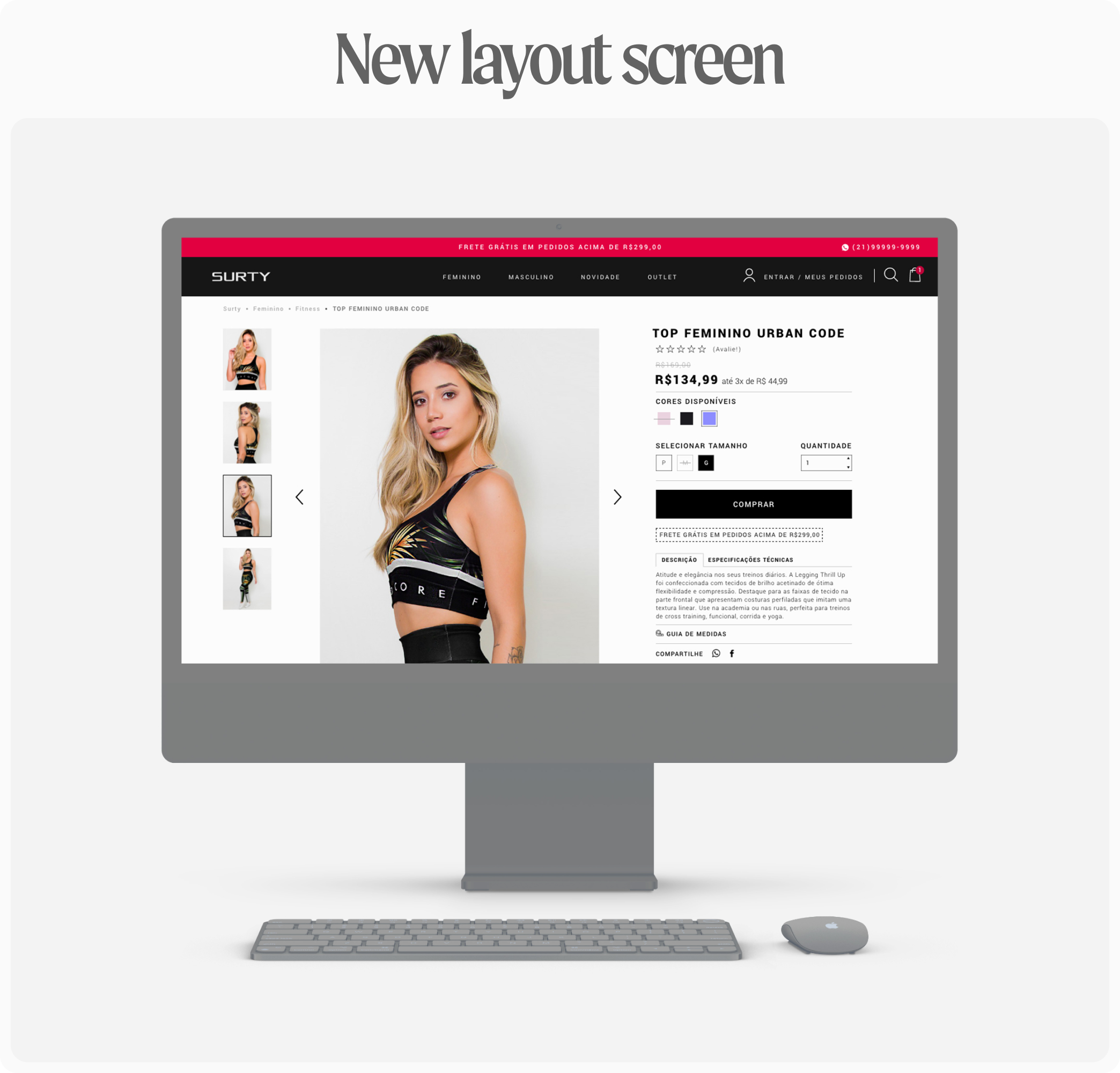
As for the product page, the visual appearance of the breadcrumb on desktop was inconsistent, with some parts in uppercase and others in lowercase, while on mobile, it was missing altogether. I needed to readjust this. In addition, I introduced product thumbnails on mobile, altered the hierarchy of elements, and adjusted the circles beneath the product image.
I didn't find it beneficial for the product to be fixed at the top on desktop, considering users didn't need to scroll much. However, on mobile, a fixed bar with the 'Buy' option at the bottom was necessary, instead of at the top as it was before. The product information could be housed in a drawer, and I believed that not all the feedback fields were essential; these could be sent via email post-purchase to avoid clutter and enhance the user experience. Thus, I retained only a concise feedback button.
Note: upon the client's request, I included a description section beneath the 'Buy' button, revamped the 'Add to Cart' modal, added the Instagram section, and improved the overall visual aesthetics of the page.
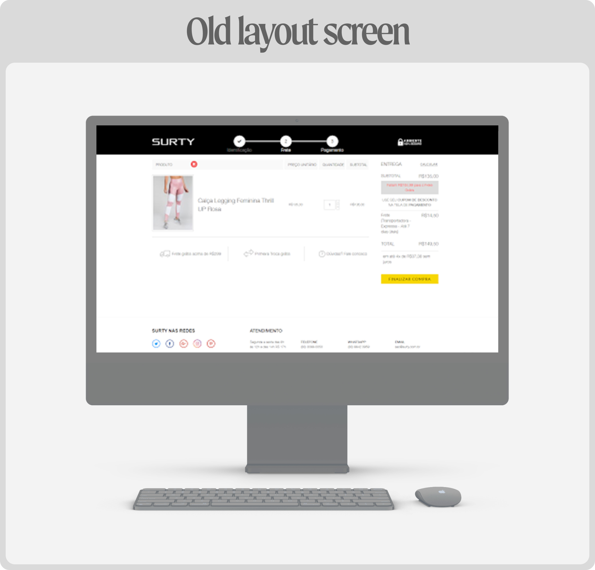
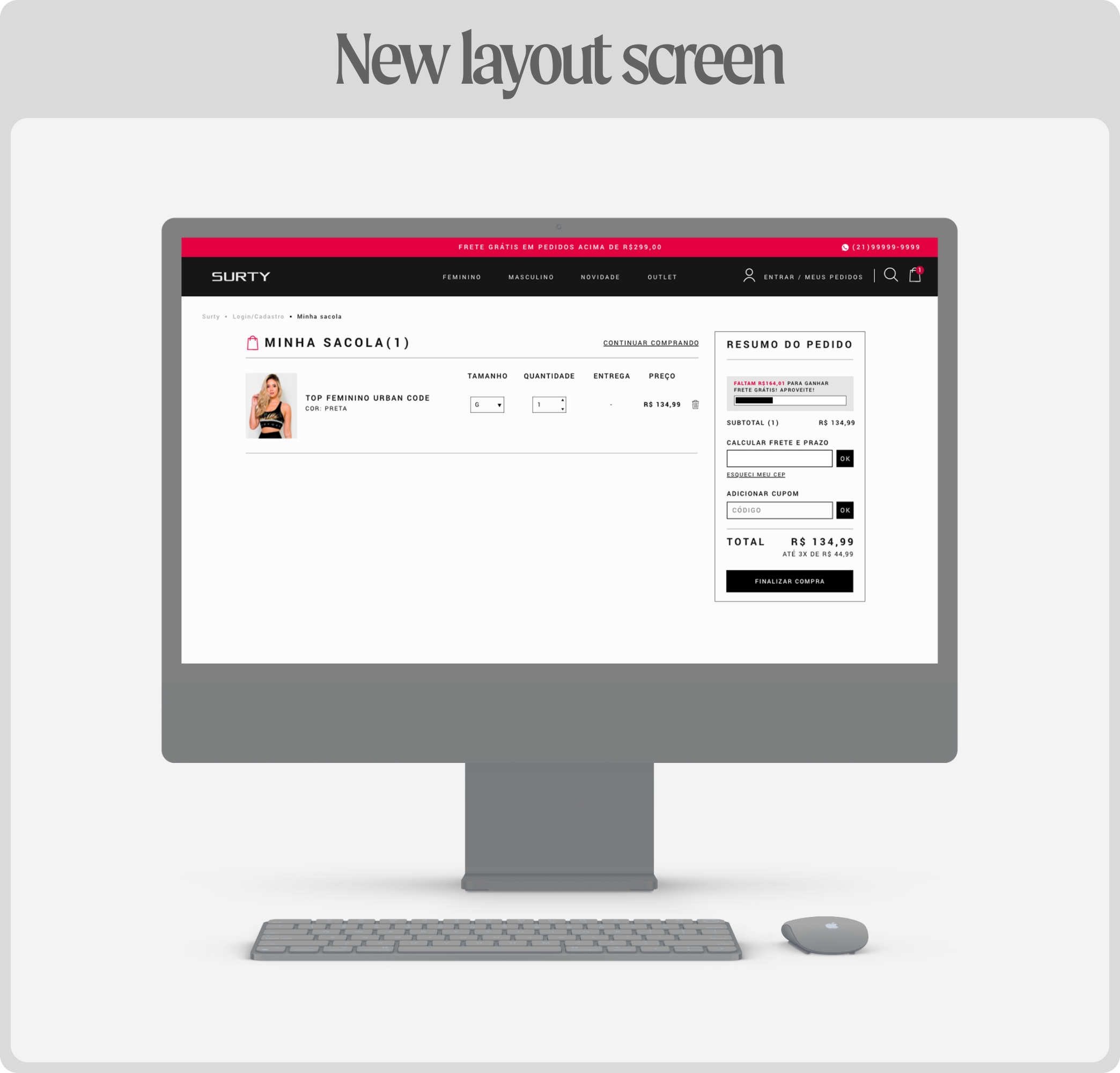
In regards to the cart page (or bag page after the redesign), on mobile, the product image was breaking the layout, overlapping with the 'unit price' title. The items on the desktop were in uppercase, and the font in the body was light, while on mobile, it was bold, not respecting the site's visual identity. Information hierarchy, value sizes, spacing, and aesthetics were all inconsistent. The section regarding delivery information needed a complete overhaul.
Note: the client's additional request was to include a bar indicating how much more is needed for free shipping.
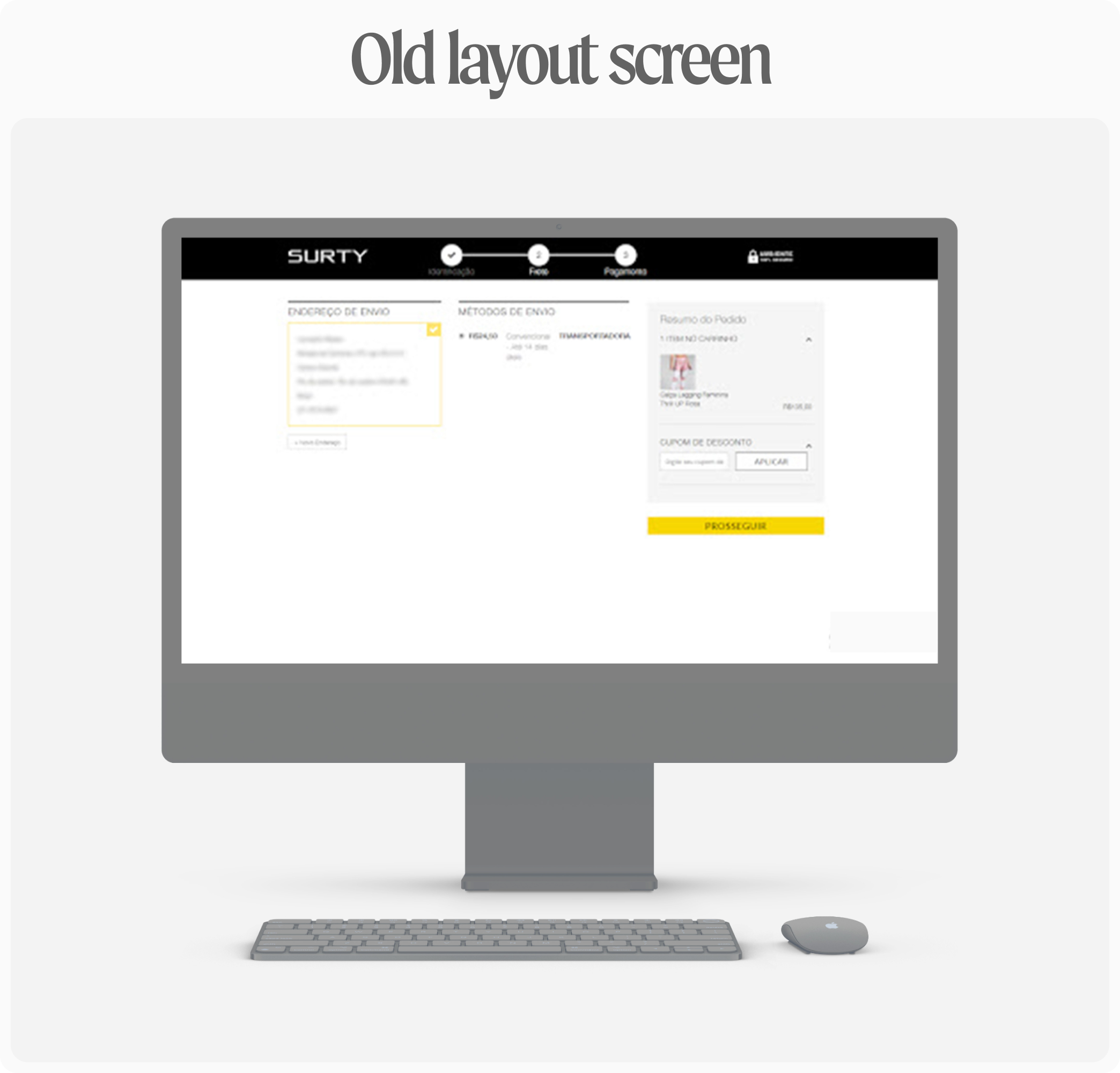
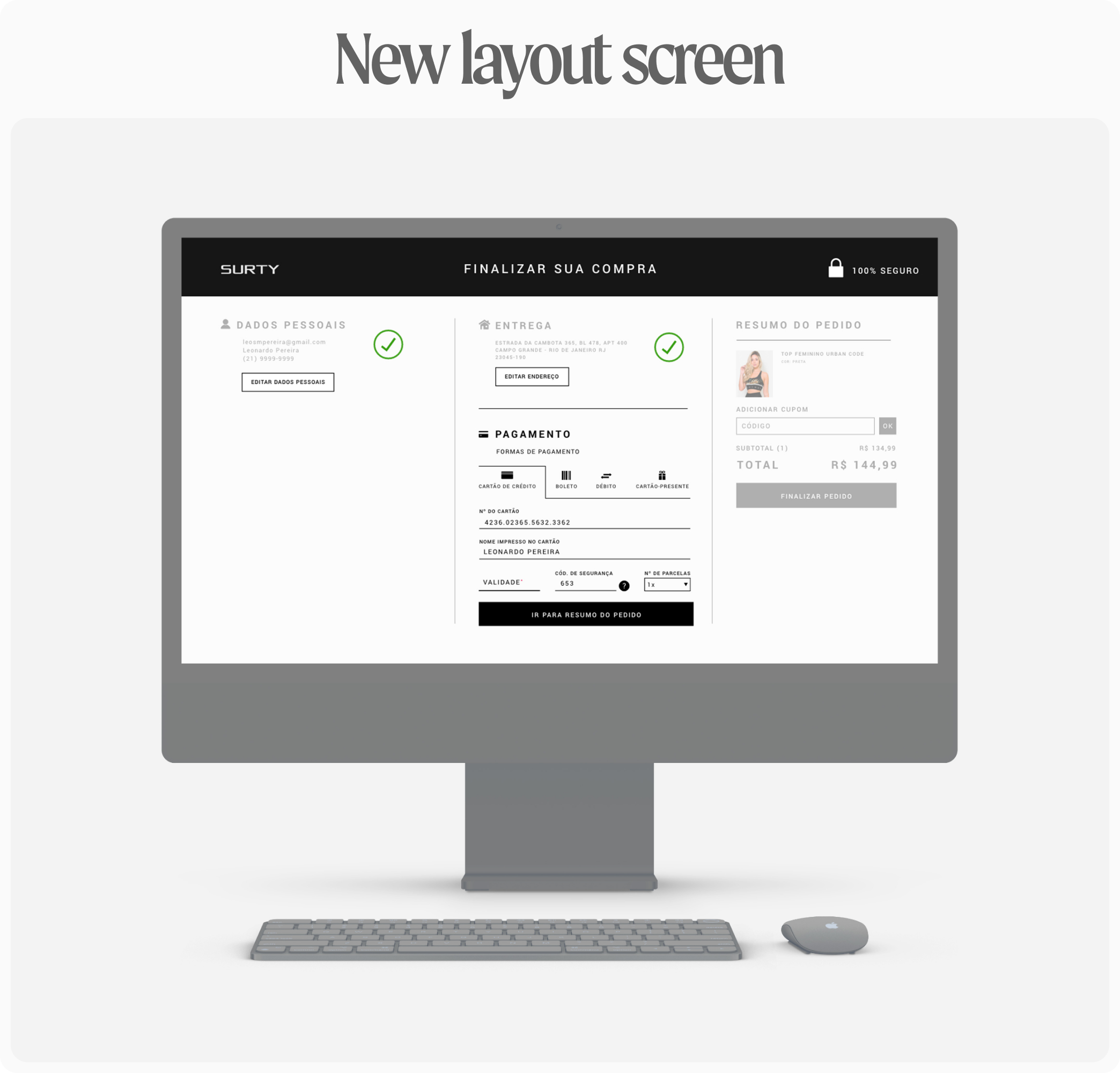
As for the checkout layout, the columns for shipping methods and order summary should have been inactive, with the user completing one section before activating the other upon confirmation. This follows an important design heuristic, the Progressive Disclosure. The 'Complete' button wasn't clear with 'Proceed,' which is an example of how the CTAs and other texts on the site were not clear. In this project, I also had to work on UX writing aspects as a whole. Additionally, some structural changes were needed to create a seamless flow.
The remaining screens would follow a similar pattern, implementing core changes while retaining some existing content. It was necessary fine-tuning aspects, line text was misaligned, and aesthetically, the hierarchy of information was lacking. Spacing between elements was highly irregular. Clearly, some technical design aspects were not adhered to, such as designing the layout using a grid. Therefore, all these points was reviewed and addressed in the new layout. I didn't have access to data before and after the refactoring, but I received extremely satisfied and positive feedback from the client regarding this endeavor.
Note: although I've incorporated more desktop screens into this presentation to a visualization enhancement, I actually started with the mobile-first concept when designing the interface, correcting a previous mistake. The old layout had given more attention to the desktop, but the client revealed that 80% of sales were through mobile devices. Additionally, the client specifically requested a website predominantly featuring female models, as they constituted the majority of their clientele. The photos used was provided by the client.
_surty.svg)
 in Sao Paulo.