Creation of Nestle's pets
department content hub
September '19
| Organization | Squad | Role |
| Webedia | Brandpublishing | Junior UX/UI Designer |
September '19
| Organization | Squad | Role |
| Webedia | Brandpublishing | Junior UX/UI Designer |
People seeking informative content about pets
It has achieved 1,5 million/month organic visits (20/september/2021), being the being the biggest pet content platform in Brazil (by Similarweb).
It's a portal that I designed for Purina, a brand under Nestlé's pet division. I initiated the project from its inception and developed it entirely, acting as the sole designer of the project while being supervised by Diego Lucas. This UX/UI venture had a particular focus on interface development. The project was considerable in scope due to its association with a highly reputable client. The objective was to establish an environment where individuals could access comprehensive information about their pets, quizzes, incorporating interactive elements to captivate users within the platform, as well as design an e-mail marketing templates for future marketing campaigns.
Since the project was developed in an agency, the client must aproove. So, the main concept was approved early on, requiring only a few minor adjustments. As the portal was created concurrently with the visual identity within the creative team I was a part of, I also contributed to the decision-making process for graphic design elements, such as the logo. I immersed myself in the brand's culture and value proposition to better understand its philosophy, and then for the website, I focused on three essential pillars: typography, colors, and shapes.
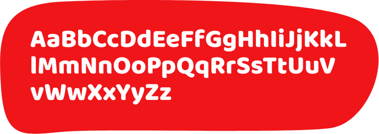
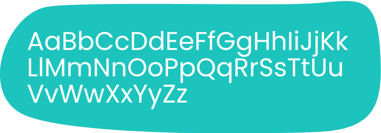
It played a vital role in this project, with the selection of two distinct fonts: Baloo Bhai for headings and Poppins for body text. The decision to use Poppins for the body text was driven by the need for a reader-friendly font, as the platform contained content with larger text blocks. Additionally, Baloo Bhai was chosen for headings, as its softer and rounded appearance conveyed a sense of comfort and ease, aligning well with the platform's visual identity.
Note: it's worth noting that both fonts were sourced from Google Fonts to ensure optimal performance of the portal.
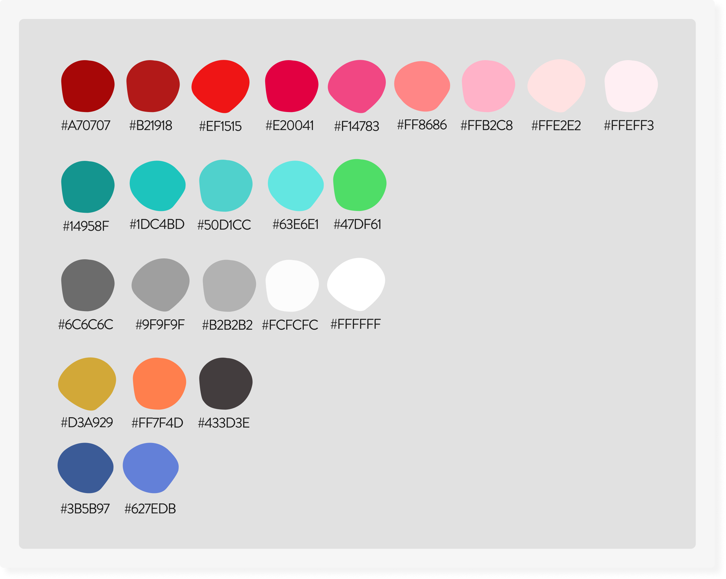
Another crucial aspect was the color scheme, which played a pivotal role in achieving the desired visual appeal of the website. As I delved into the design of the site, making decisions about color became paramount. While the Patas da Casa website was owned by Purina, it operated as an independent brand with an undisclosed affiliation. However, the eventual connection to Nestlé was on the horizon. I devised a strategy to ensure that the site's visual identity would seamlessly transition without requiring a complete overhaul. To achieve this, I initially considered a combination of red (Purina's brand color) and purple (as seen in the previous image) due to their analogous relationship. These hues share tonal similarities, resulting in a harmonious visual palette. However, at the client's request, I explored alternatives to purple, as competitors also featured it prominently in their branding.
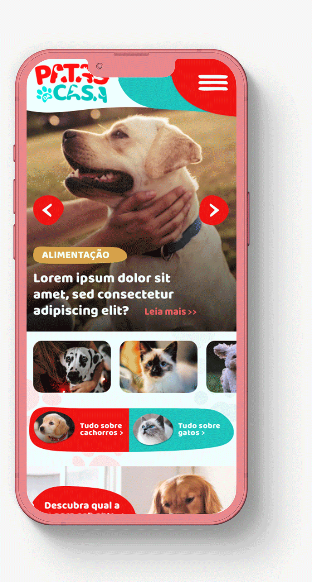
At this juncture, I had already made the decision to visually differentiate content related to dogs from that of cats, the two primary pets targeted by Purina. The visual separation aimed to enhance user experience, as individuals typically seek information exclusively about their own pet. Thus, based on this premise, I assigned specific colors for each pet. The color red was chosen to symbolize content associated with dogs, while green was designated for content related to cats. This color distinction was aligned with the user's perspective and allowed for effortless differentiation. The choice of soft shade of green green for cats was deliberate, as it is a complementary color, situated directly opposite red on the color wheel, effectively adhering to the color scheme I had envisioned, both becoming the primary and secondary colors of the platform.
Note: furthermore, given that the color assigned to dogs served as the primary hue of the website, it also encompassed instances where information pertained to both dogs and cats, as well as other pets.
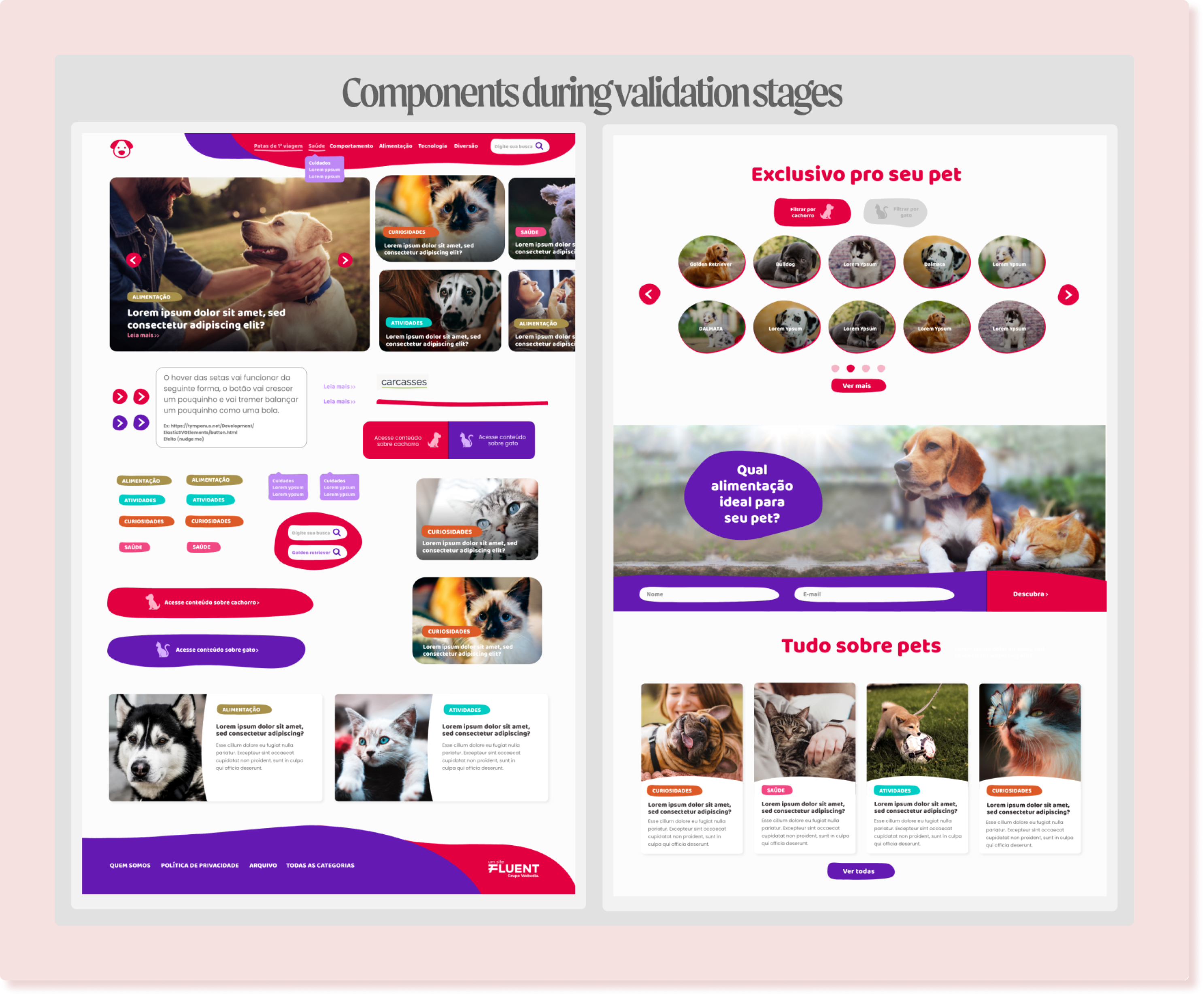
As third pillar, the shapes played an important role. My intention was for this portal to have an appealing visual, so the shapes had a significant impact, as they exude a sense of fluidity and lightness. Additionally, the hover interactions contribute to enchantment by mimicking inflation or continuous movement, sometimes even a bit quirky, mirroring the behavior of pets.
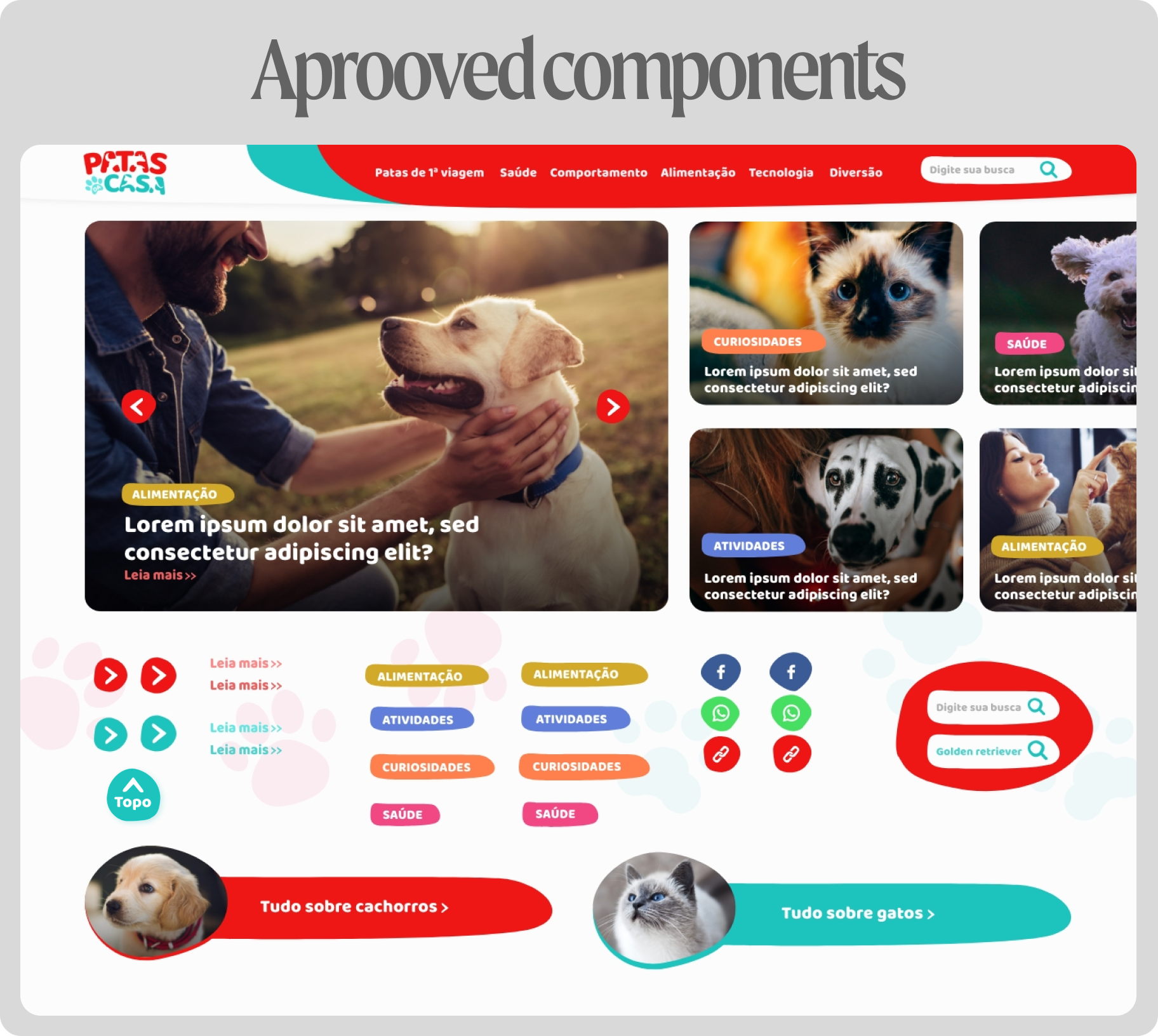
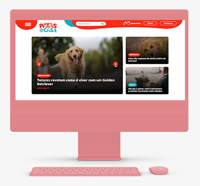
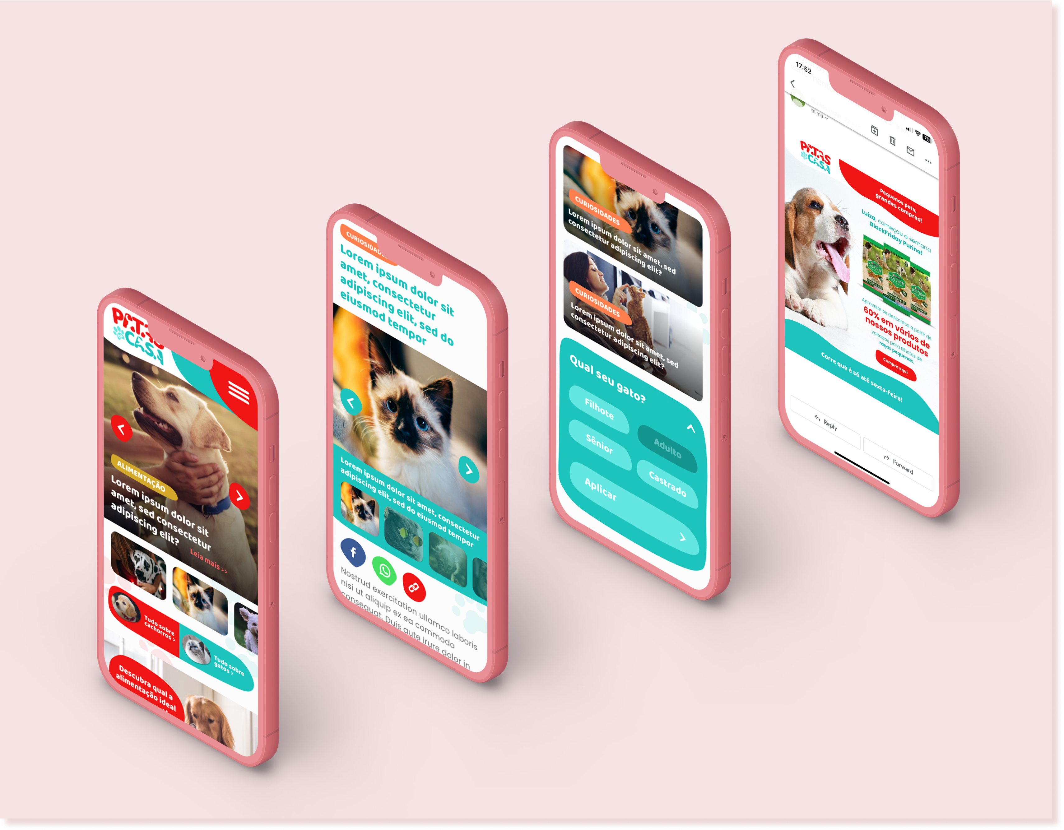
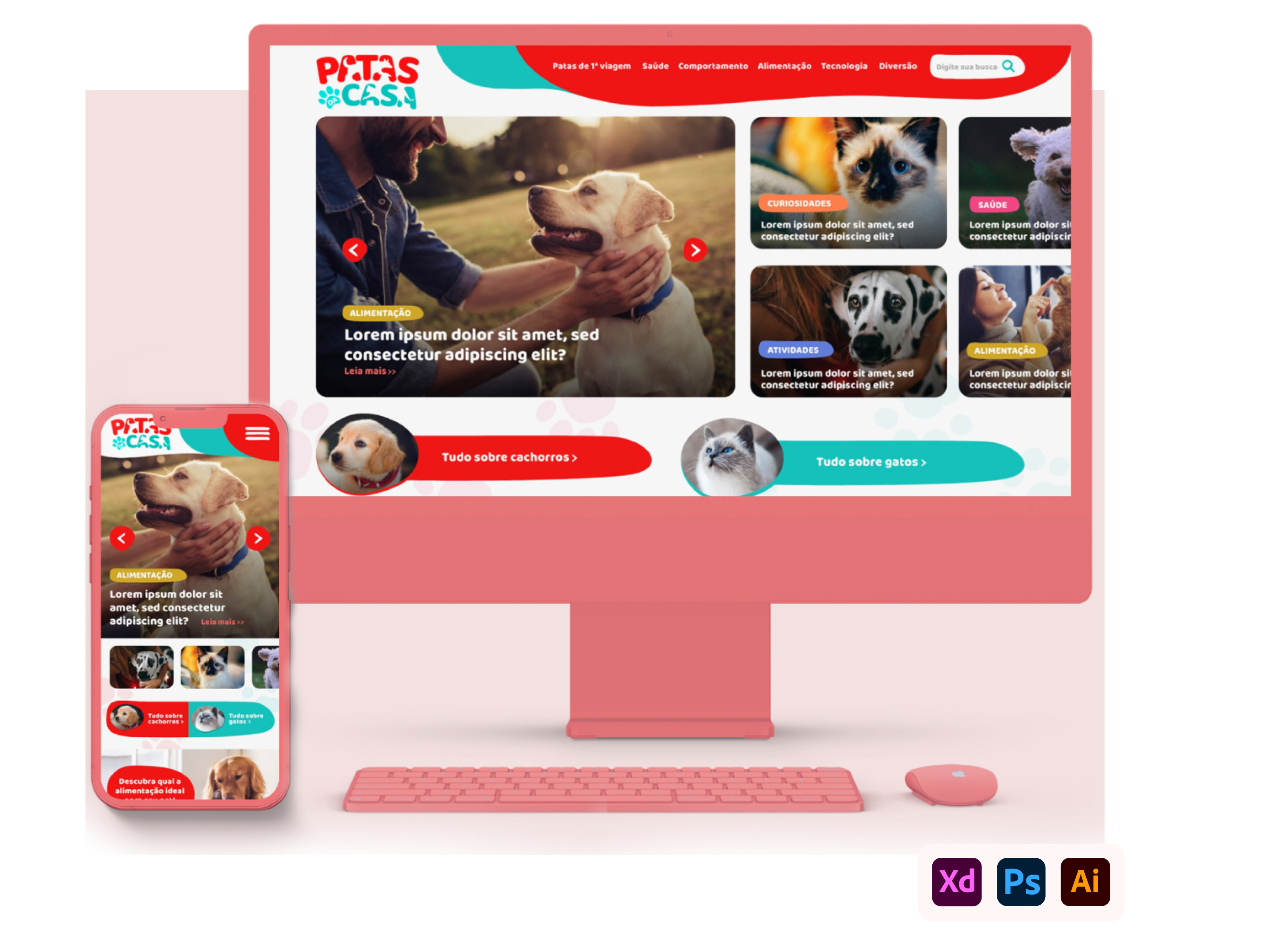
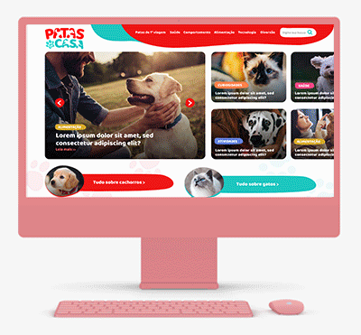
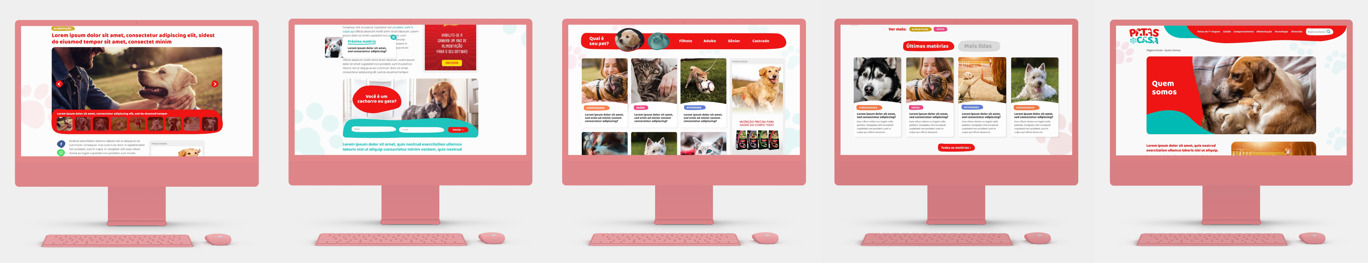
I prioritized photos, creating an identification with the target audience, which generally consumes and shares a lot of pet photos. Above the fold on the homepage, I designed a slider model featuring the main articles of the site. Users have the option to view the main article and get a small preview of the other news. The animation to pass the news adds dynamism and modernity to the user interaction. Just below, with categorized access buttons for dogs or cats, I strategically created these buttons. When clicked, the user is immediately directed to all content related to the desired type of pet.
From the middle of the homepage downwards, there's a banner/quiz section. One of the main goals of the platform is to capture leads and user data. For this purpose, I designed a quiz that provides users with tips on how to better feed their pets. To participate in the quiz, users need to provide their name and email (thus generating a lead database). Questions such as the pet's breed, size, age, weight, etc., that's help gather valuable information and data about the target audience.
Finally, there's the article section, where it will be displayed the latest published articles. Each article card showcases the main photo, associated tag, title, and a brief preview of the content. A 'See All' button has also been included. Clicking on this button directs users to a page displaying all the site's articles
.Last but certainly not least, a critical aspect I meticulously integrated into the site was SEO optimization. Given that it's a content platform, I aimed to ensure that articles would rank well in search results. I considered various factors, including the site's responsiveness to guarantee adaptation across different devices, thus delivering a consistent user experience on all screens. Visual hierarchy was balanced, adjusting font sizes and spacing to emphasize titles, subtitles, and crucial content sections. Breadcrumbs were implemented to assist search engines in comprehending the site's structure, along with helping users navigate. Legibility was prioritized, employing fonts at sizes conducive to easy reading, with proper spacing to allow comfort able reading. Lastly, I included social buttons to encourage users to share content across social media platforms.
This is a project that I'm proud to present, as all these elements were combined to create a user-friendly and charming environment. Pets evoke pleasant memories, and I aimed for users to experience the same sentiment upon entering the site,
while also ensuring that the platform maintains a high level of quality. By having met the brand's expectation of becoming
the largest pet content platform in Brazil, it reflects the culmination of my efforts. At the same time, it encompasses the accumulated knowledge I gained from designing other content platforms.