Creation of Qualia's
Pratical Home Hub
November '18
| Organization | Squad | Role |
| Webedia | Brandpublishing | Junior UX/UI Designer |
November '18
| Organization | Squad | Role |
| Webedia | Brandpublishing | Junior UX/UI Designer |
People interested in food content, recipes, and home care.
|
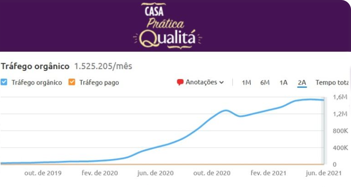
With just organic traffic has achieved
1,5 million/month visits
(20/september/2021). (by Similarweb). |
It was the first major UX/UI project I participated in, led by Lorrainy Machado and supervised by Diego Lucas. Lorrainy played a key role in driving the project, with my involvement being as a supportive Designer, actively assisting her in its conception. The project's briefing was to create a practical home website for Qualitá (a company belonging to one of the largest retail groups in South America's food sector). The intention was for the platform to provide content that addresses the simplification of all household tasks and challenges, making them more practical to solve using Qualitá products, content pages where the audience could read about food-related content, recipe preparation and tips for household routines and engaging content pages.
At the end of the day, the main objective was to increase the customer base for the large supermarket chains within the network, such as Extra and Pão de Açúcar. Therefore, at various key points in the product, we inserted links to guide customers to the e-commerce platforms of these markets. The client wants that this website contribute to repositioning the brand with a new visual identity and a broader range of product lines, in a broad sense, aiming to be perceived by the audience as a brand offering quality products at fair prices.
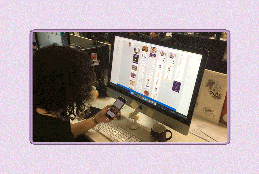
Note: one of the significant challenges of this project was designing a site of this size and importance within a short period of time, This project had a greater focus on UI within the UX/UI framework. The site was designed with considerations for both Desktop and Mobile.
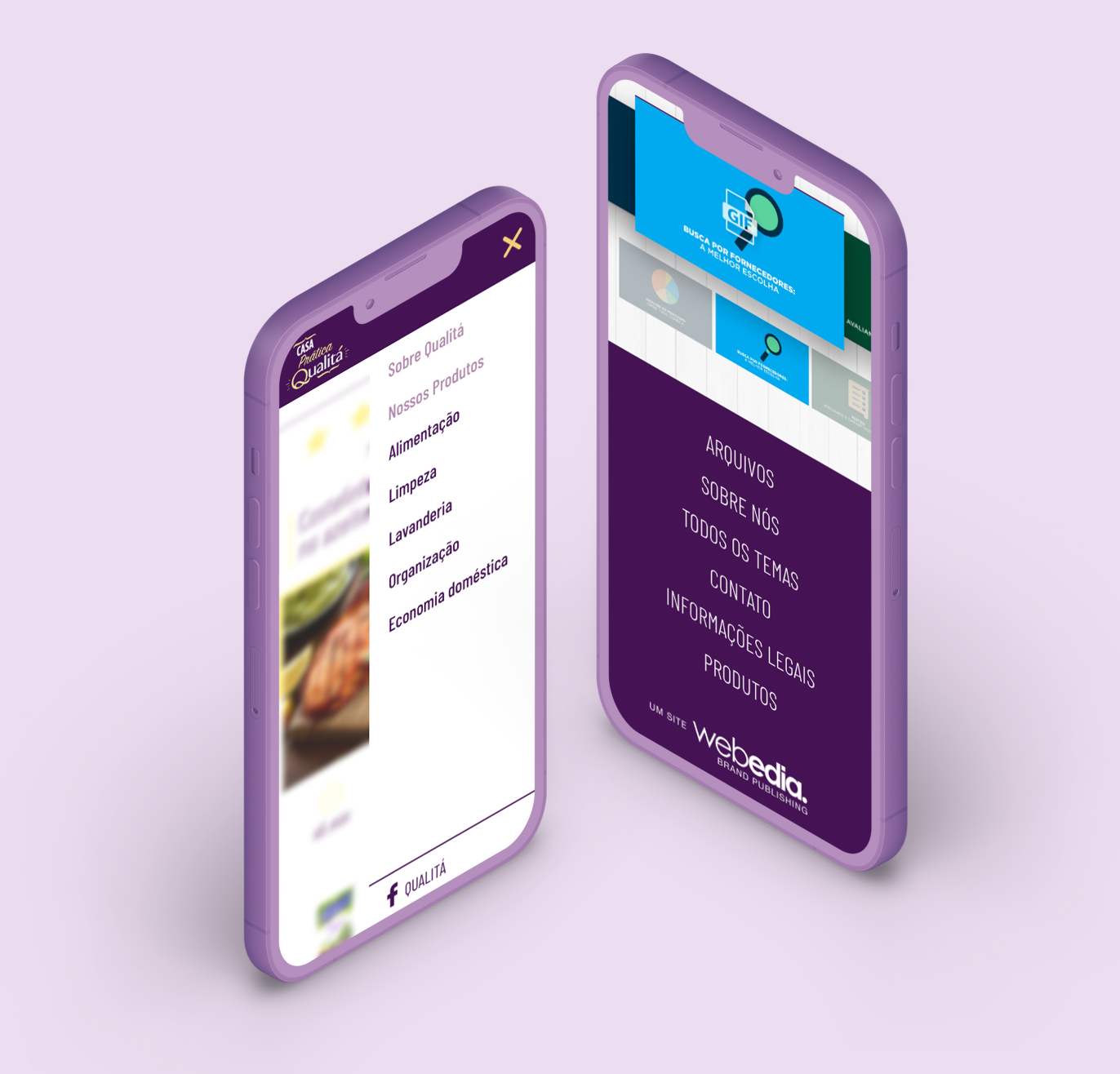
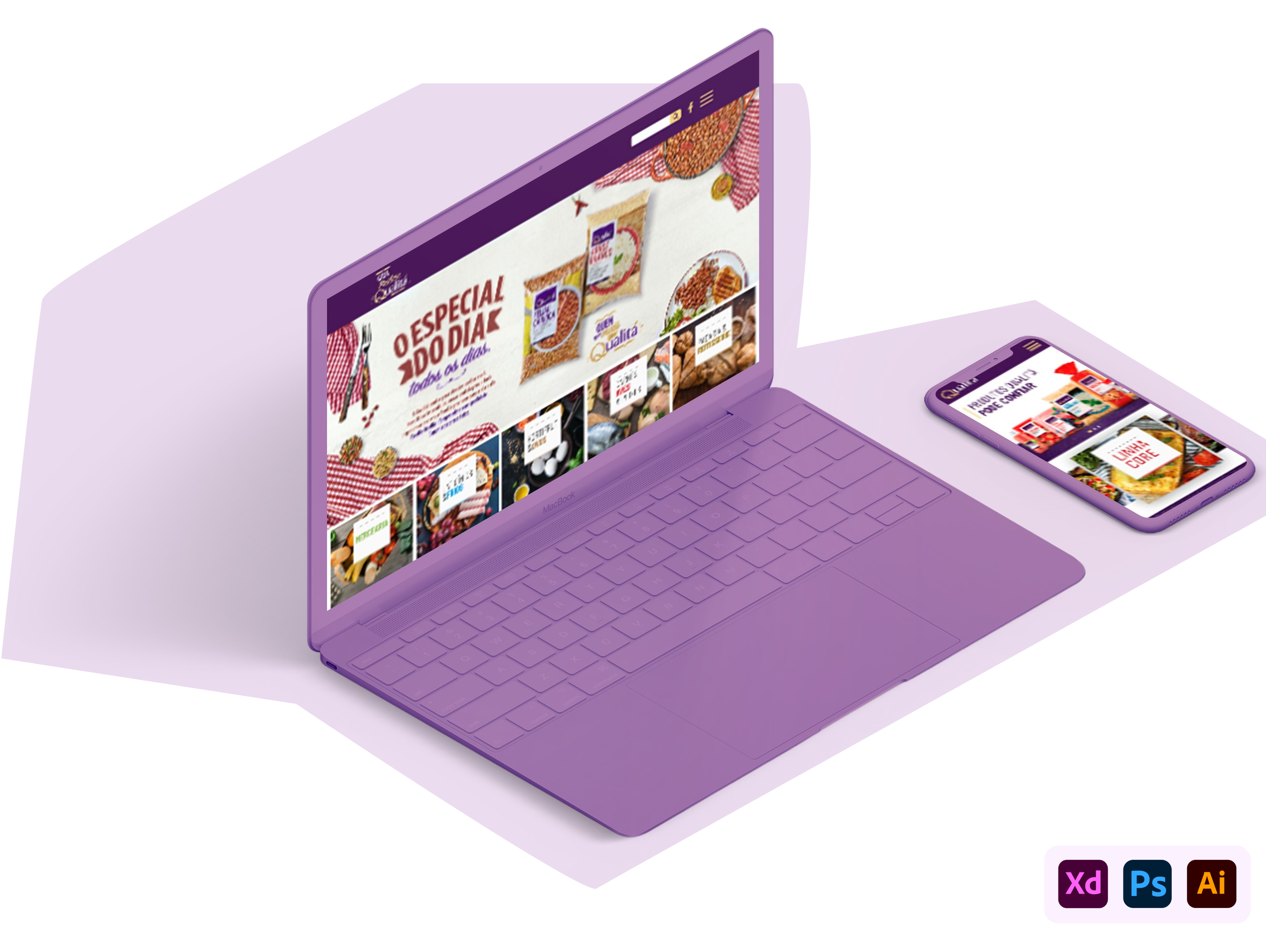
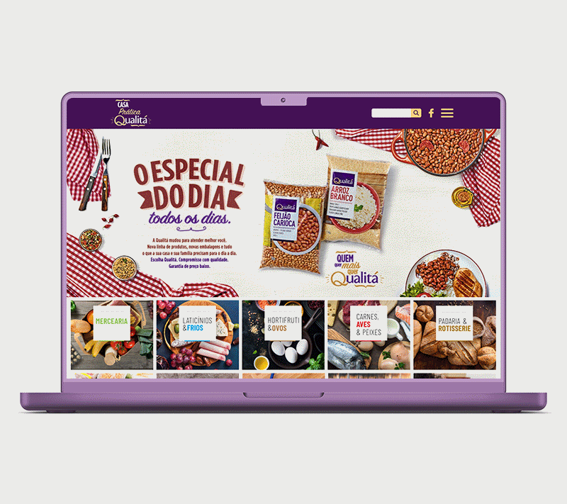
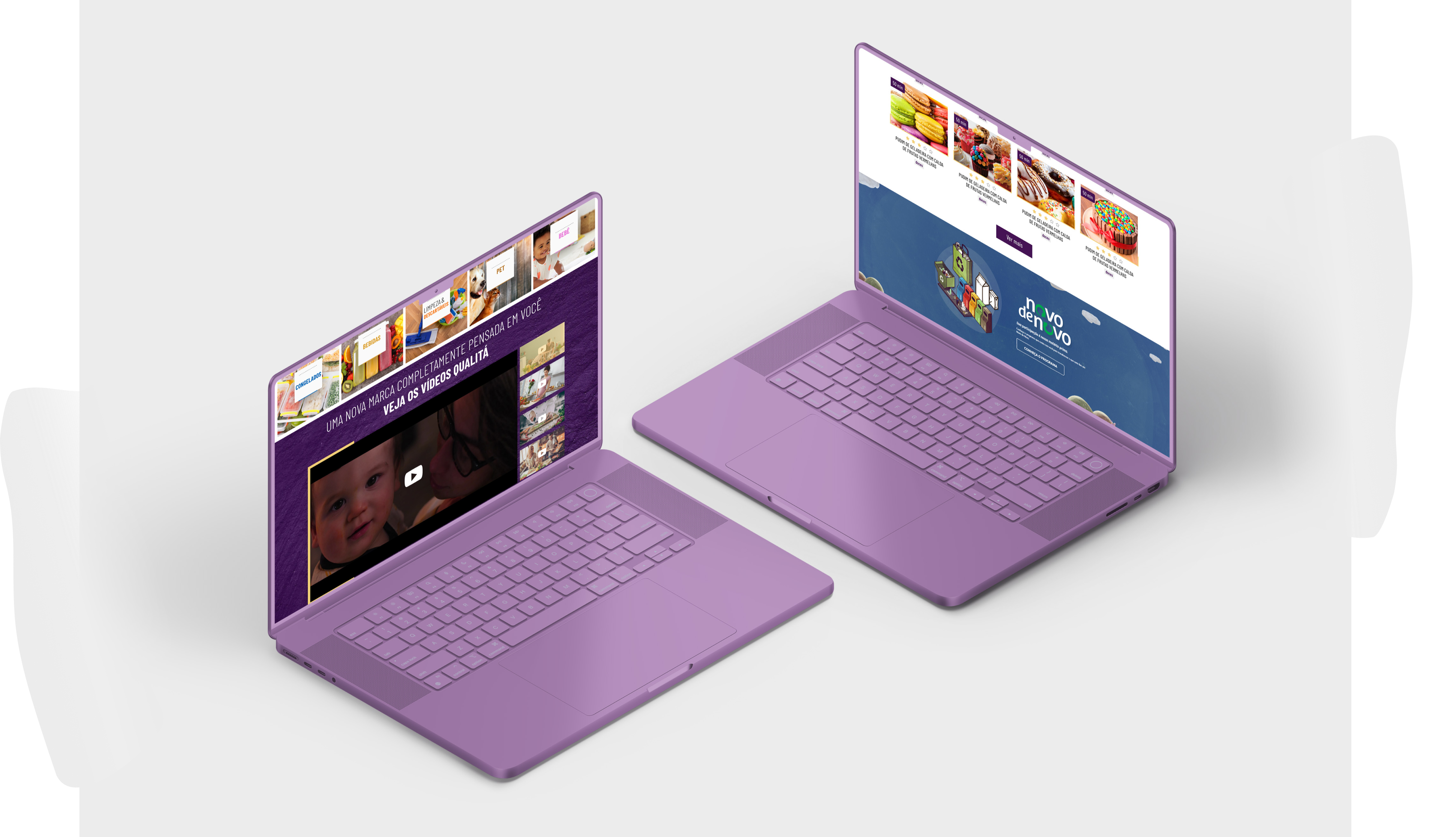
This was a project that heavily relied on the brand's colors for the overall visual identity of the platform, namely yellow and purple. The header components included a prominent search feature, a link to the brand's Facebook page (the main social network for the project), and a menu with links to categories and institutional pages. Similarly, the footer also provided links to mostly institutional pages.
In terms of the home page, we focused on visually striking elements. A generous space was allocated in the hero section for showcasing Qualitá's product promotions. This was followed by categorized topics, using a variety of colors to bring dynamism to the area and leveraging imagery as background visuals.
Below, there's a section for videos, prominently featuring the brand's main institutional video, followed by thumbnails of other institutional videos embedded from the brand's YouTube channel. The visual context includes the use of textures to enhance the visual composition.
In the next section, an area was designed with a tab-like component allowing users to switch between recipes and articles, accompanied by a 'View More' button at the bottom. This is followed by a section with a banner that links to a specific page, which could be regularly updated through the CMS. Finally, there's a section featuring a carousel of institutional motion graphics gifs with thumbnails below, serving as a form of pagination.
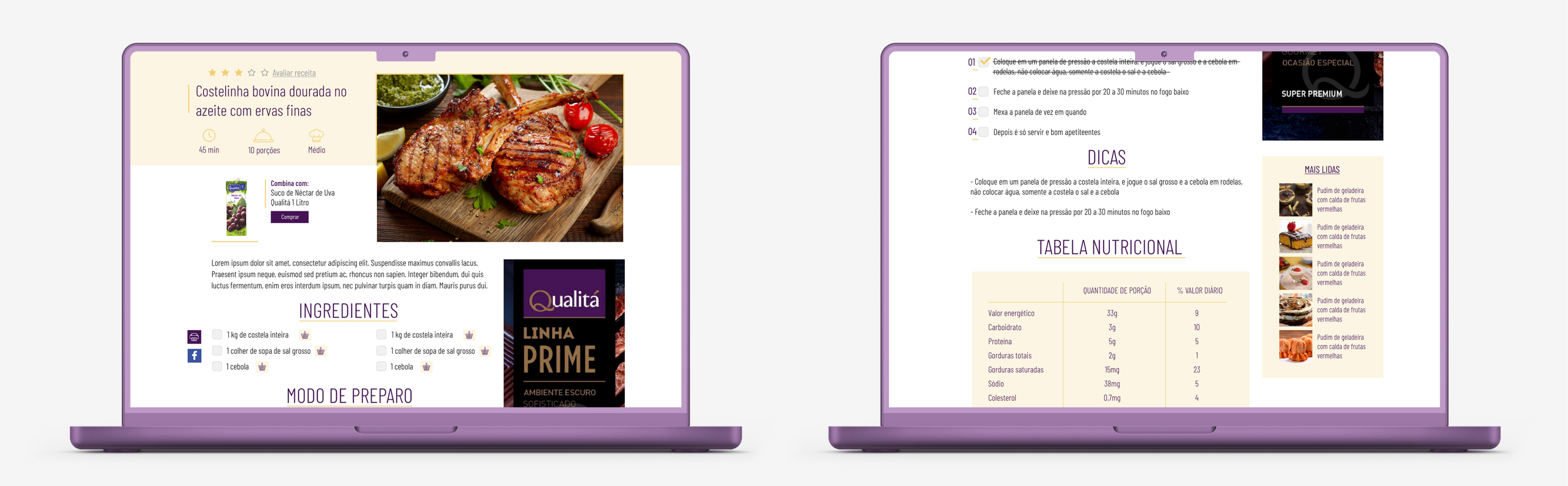
In terms of other pages, specifically the recipe page, it was quite interesting to design. On this page, we offer the option for the user to rate the recipe, and in the title's spotlight, we showcase the preparation time, average serving quantity, and cooking skill level required. Below, we present a Qualitá product with a link button to the group's supermarket page. After the recipe description, we provide a list of ingredients and the preparation method with checkboxes to make it easier for users who are cooking the recipe to tick off completed steps.
Next, there's a section for tips, followed by a nutritional table detailing the meal's composition. This is followed by other tags, a banner linking to the group's supermarket site, and then a section featuring more related recipes. Additional elements on this screen include a print button for the recipe or sharing it on Facebook. There's also another promotional banner and a card featuring the most read articles (both of which are consistent across other pages).
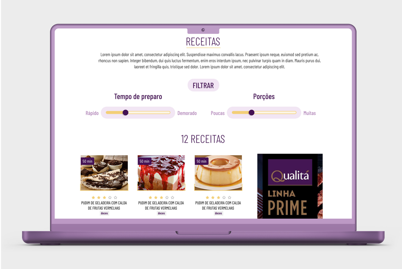
Still within the culinary domain, we have the All Recipes page, where we also introduced a filtering component. Here, users can choose the preparation time (quick or slow) and the number of servings (few or many), a functionality designed to assist customers who might not always know exactly what they are looking for when it comes to cooking.
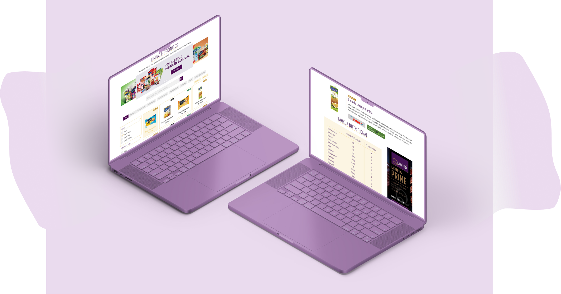
Continuing with the remaining screens, we have the catalog page, which shares similarities with an e-commerce catalog. At the top, there's a carousel of promotional banners. Below, a specific product search feature is provided with filter chips for different categories. This is followed by a filter menu and the display of products with their tags.
If a user clicks on a product, they will be taken to the specific product page with its description, links to purchase it from the group's supermarkets, nutritional information table, carousel of related products, related recipes or articles, and a promotional banner.
Note: the product detail page was designed with a clear conversion goal on the client's part, hence the buttons leading to the group's supermarket pages.
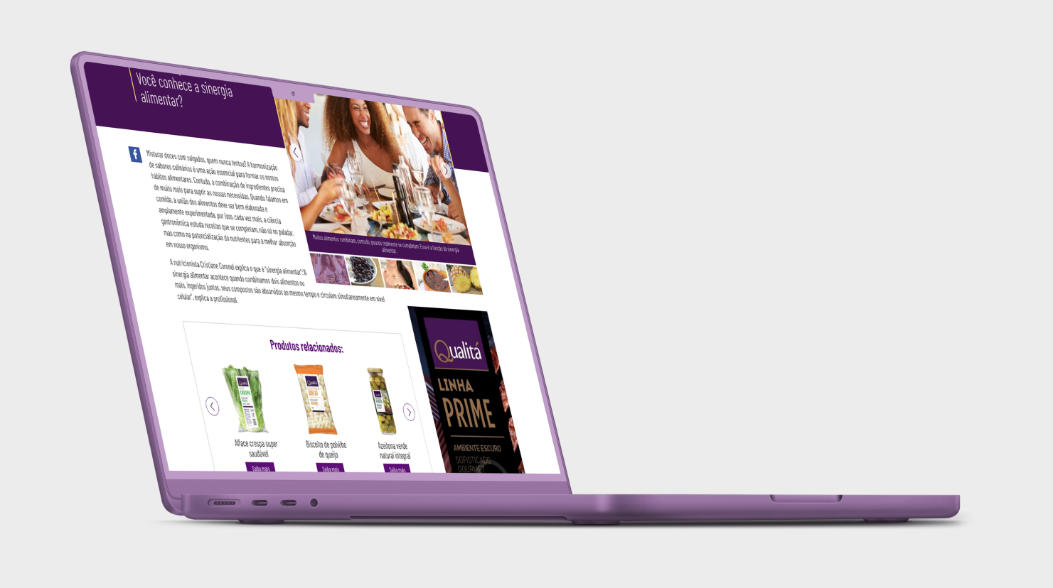
We then arrive at the article page, one of the pages that functions as a sort of blog within the portal. This page is crucial for increasing traffic on Google. On this page, we have related images and thumbnails, a carousel of products related to the specific article, which could be related to food, home care, among others. Followed by global components, promotional banners, tags, and related articles
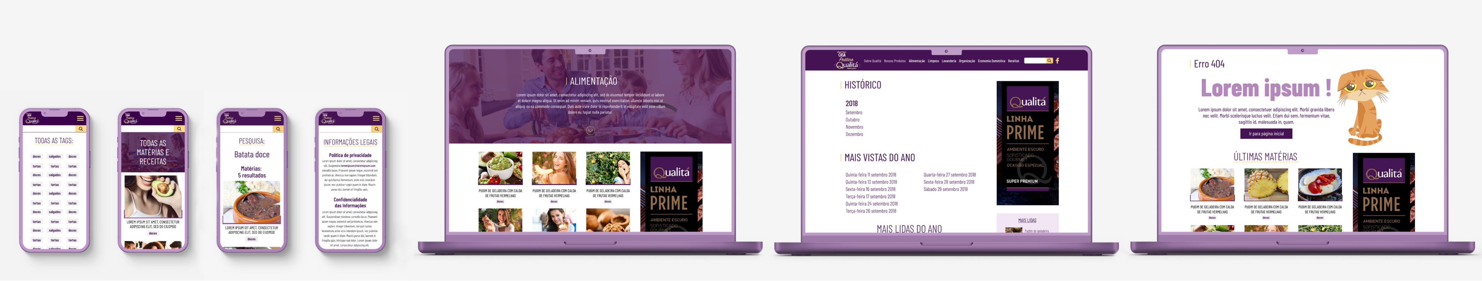
The project also includes important SEO pages, such as All Tags, All Articles, search results page (which in this case is divided into articles and recipes), Legal Information, specific Tag pages, Archive with views: overall, annual, monthly, and daily. We also have the finally, the 404 page.
In this presentation, it is important to highlight the significant results that the platform achieved. In just 4 months after its launch, it achieved remarkable monthly visits, exceeding the established performance target for the period. Additionally, a noteworthy milestone was reached with an high number of page views on a single article. On September 20th, 2021, the platform reached an organic traffic of 1,5 million monthly visits.
Note: this is a project I was able to oversee during the quality assurance stage at the time, ensuring that it matched the exact outcome of what had been designed.