Designed Amil's informational articles portal
February '19
| Organization | Squad | Role |
| Webedia | Service MKTP | Junior UX/UI Designer |
February '19
| Organization | Squad | Role |
| Webedia | Service MKTP | Junior UX/UI Designer |
People interested in wellness and health-related content.
It has 135,5k/month organic visits (20/september/2021).
Portal that I designed under the supervision of Diego Lucas. The goal was to build a content platform for Amil (one of the largest health insurance companies in Brazil). Therefore, the entire project was conceived to function as a news portal catering to both desktop and mobile versions, featuring various articles related to the healthcare field.
While the intention was to keep people well-informed, the brand's objective was to become even more of a reference in the Brazilian market when it comes to healthcare (healthcare systems and health plans), supported by a massive SEO strategy and providing content for social media.
Note: this project was significant for me, as it was not only the first portal I designed entirely on my own, but it also provided me with exposure to working on a healthcare-related project with a tight deadline. The entire project was conceived and executed in less than a month.
The project began by engaging with the client (Amil), understanding the company's values, and their aspirations for this platform. With the entire context in mind, a benchmarking process was initiated to explore the paths I should follow and to gather visual inspirations that would lead to the desired outcome envisioned by the client.
Since it's a project in the healthcare sector, its visual aspect needed to convey both credibility and comfort, considering that users might be seeking information while dealing with health-related concerns.
After commencing the design and conceptualization of the project's interface, the client approved all the designed components, screens, and flows. The only aspect that required further revisiting was the color palette. While my initial suggestion leaned towards shades of green, the client liked it but felt it needed something else.
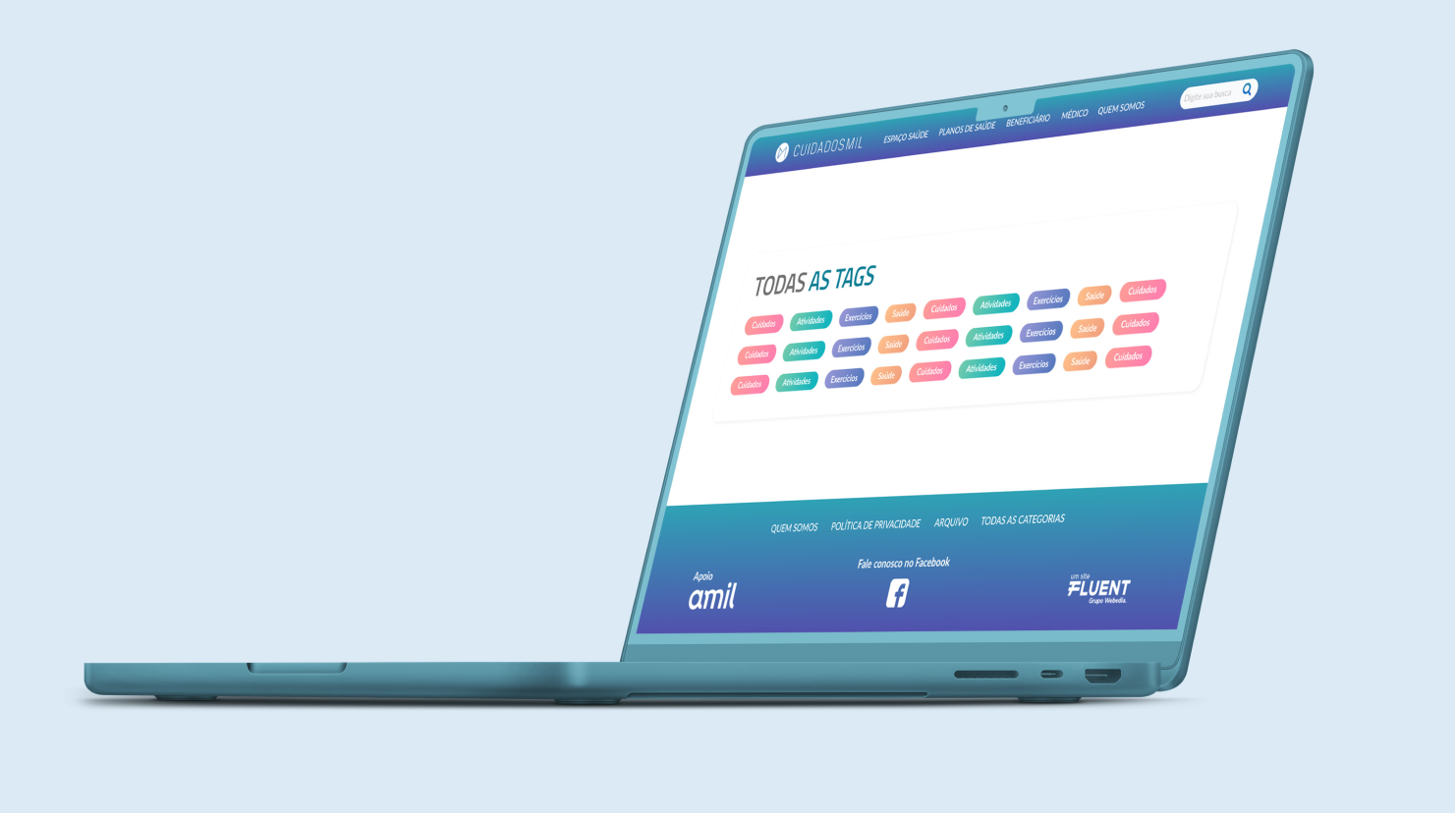
With this feedback, I worked further on the overall identity, shifting the colors towards a bluish green to a bluish purple. This approach incorporated the desired concepts. Additionally, I integrated the other colors that had already been validated and were associated with content tags for the news articles: Care, Activities, Exercises, and Health.
These tags were validated by the editorial team. The chosen colors were deliberately contrasting to allow users over time to associate them with specific content types, while maintaining visual harmony.
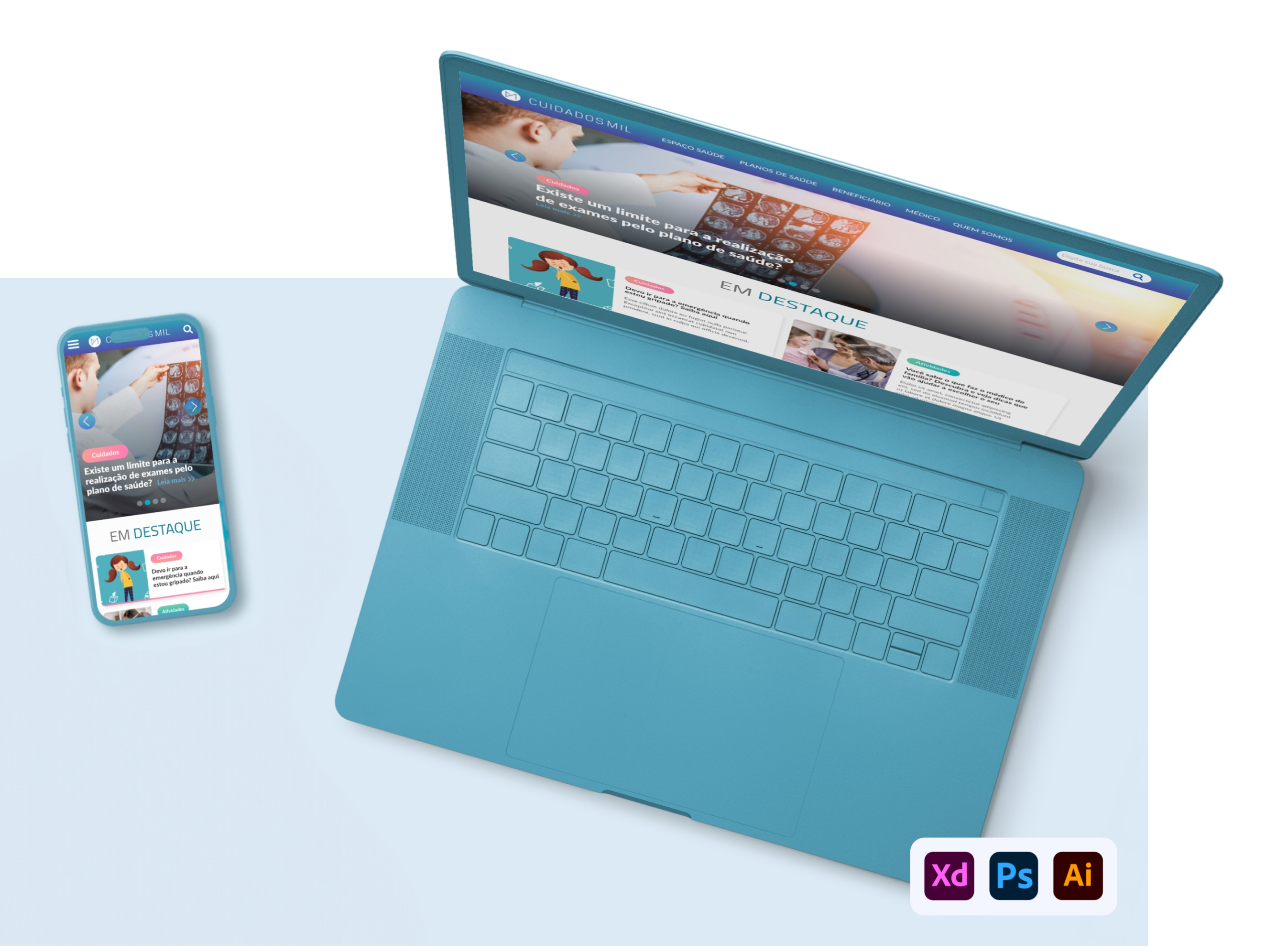
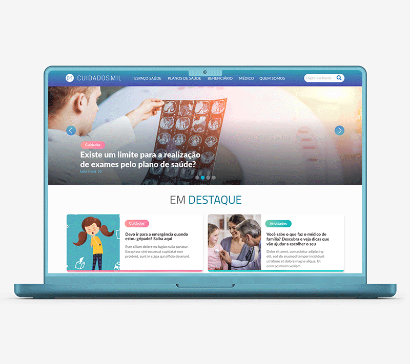
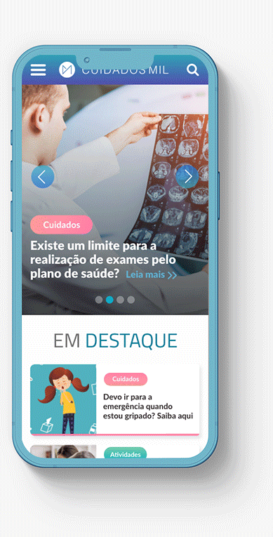
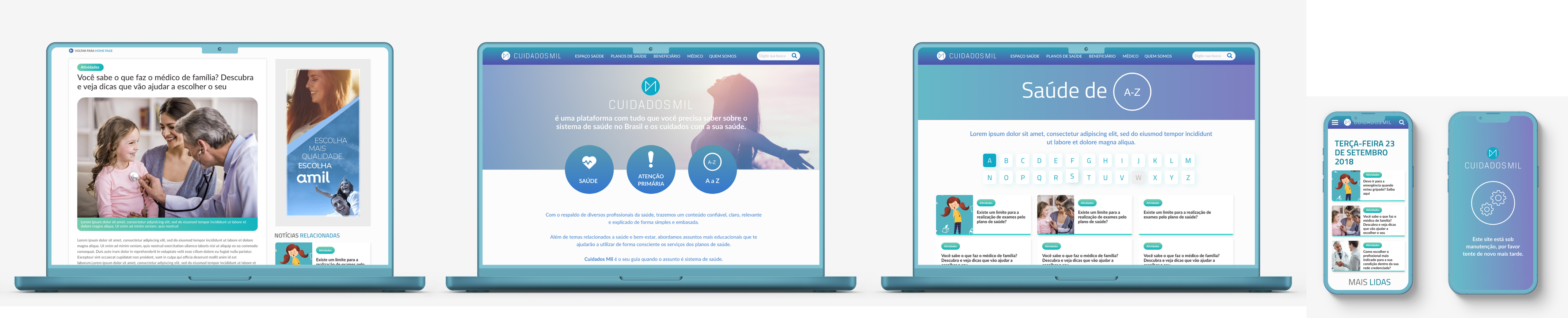
The strong combination of an SEO approach and the goal of the hub being very straightfoward to users led to certain decisions being made. In terms of the header and footer (which are relevant sections throughout the navigation), the header had links directing to specific category pages, institutional pages, and the search function. In the footer, there would be the 'powered by' statement from the brand, social media links, and the agency that developed the project (the one I worked for), along with links to institutional and SEO pages.
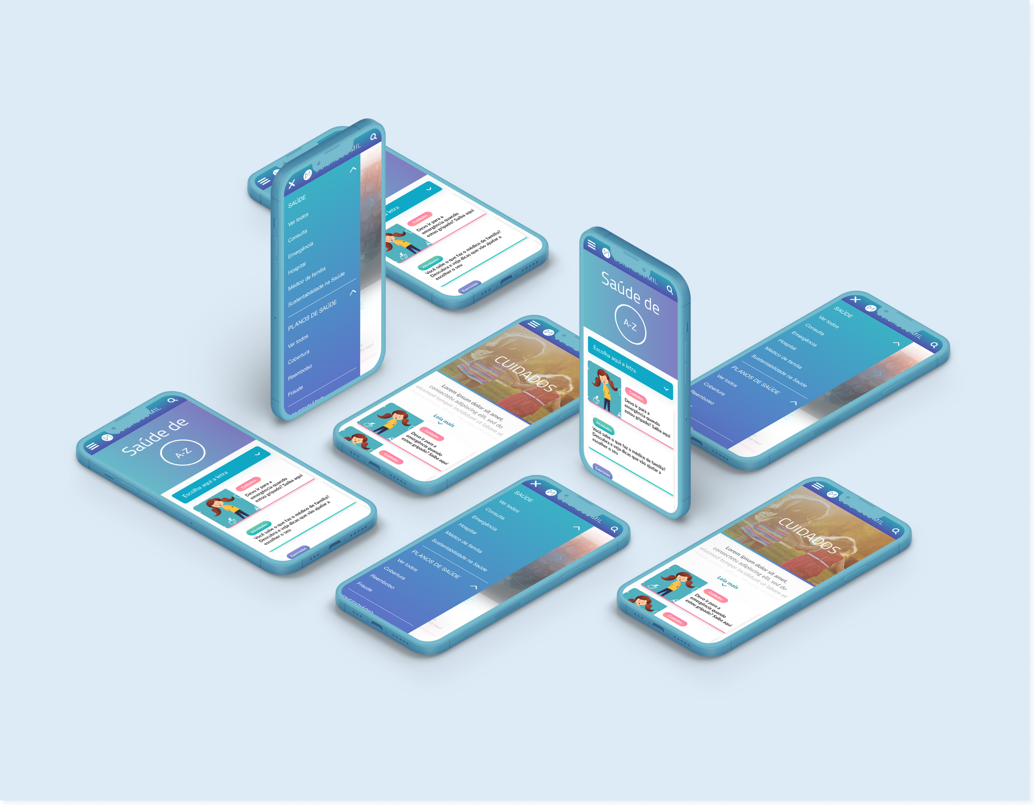
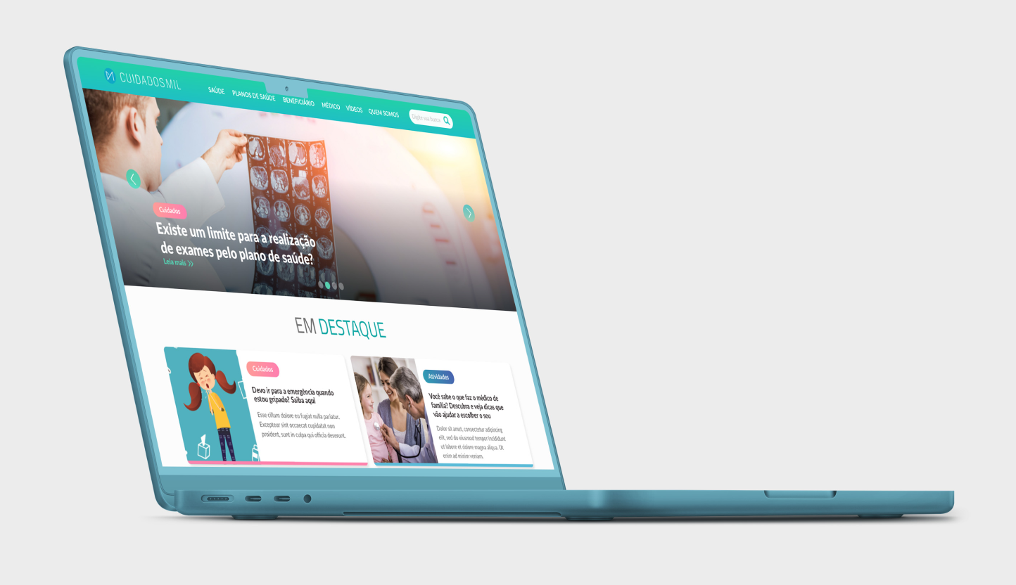
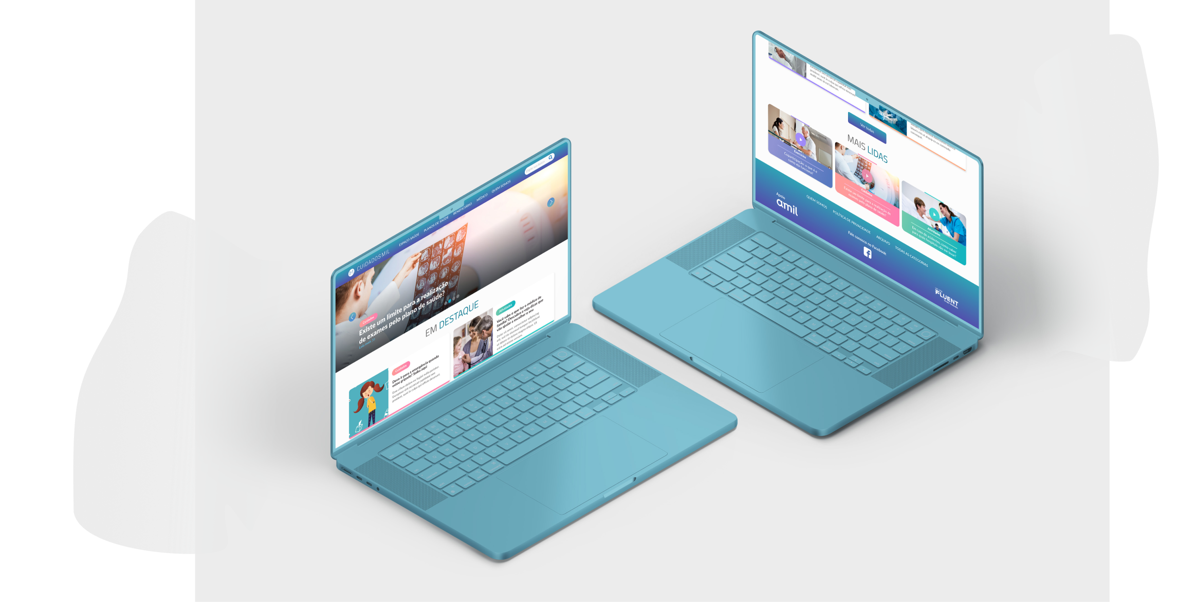
As for the homepage, it was divided into just three sections: a news carousel, featured news with a button leading to a live news screen with the main articles, and just below, a section with the most read articles.
On the other pages, such as the news article itself, it was possible to embed photos and videos. There's also a section for the latest news, a banner for commercial promotions and related news, and a 'Contact Us' button via Facebook. The 'About the Platform/Who We Are' page highlights the main informational pillars, followed by the Tag page, where all content is classified by the respective tag.
There's also a 'LiveNews' page featuring the latest articles, a page to filter articles by the initial letter of their tags, an Archive page where articles can be viewed by year, month, or day, an institutional information page, and finally, an 'Under Maintenance' page for use during construction or for future updates. All these screens were designed to help users easily navigate.
In conclusion, in regard to this project, it performed well in terms of SEO, achieving impressive results such as 135,5k/month organic visits, thus meeting the client's and agency's expectations and goals.