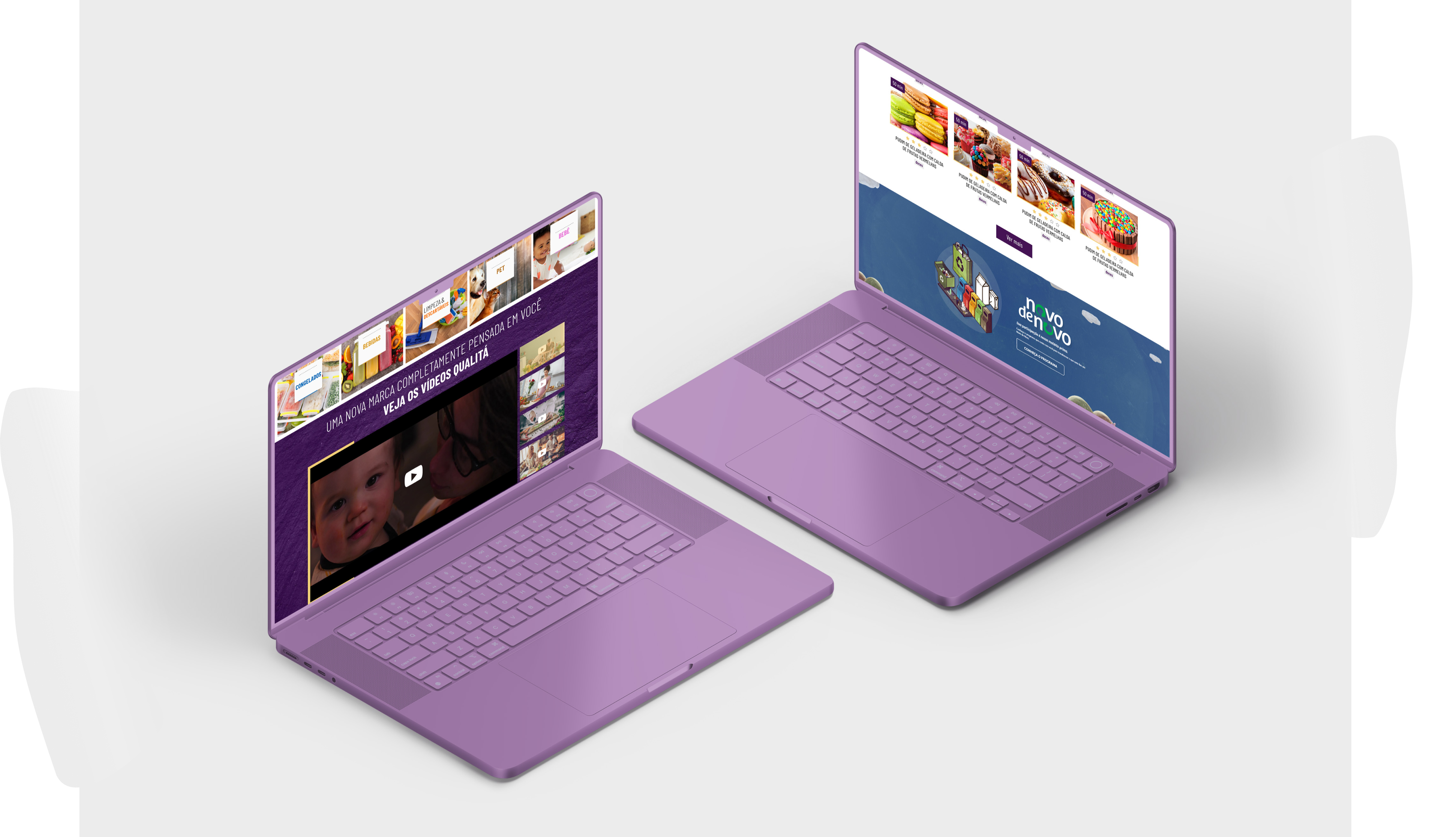
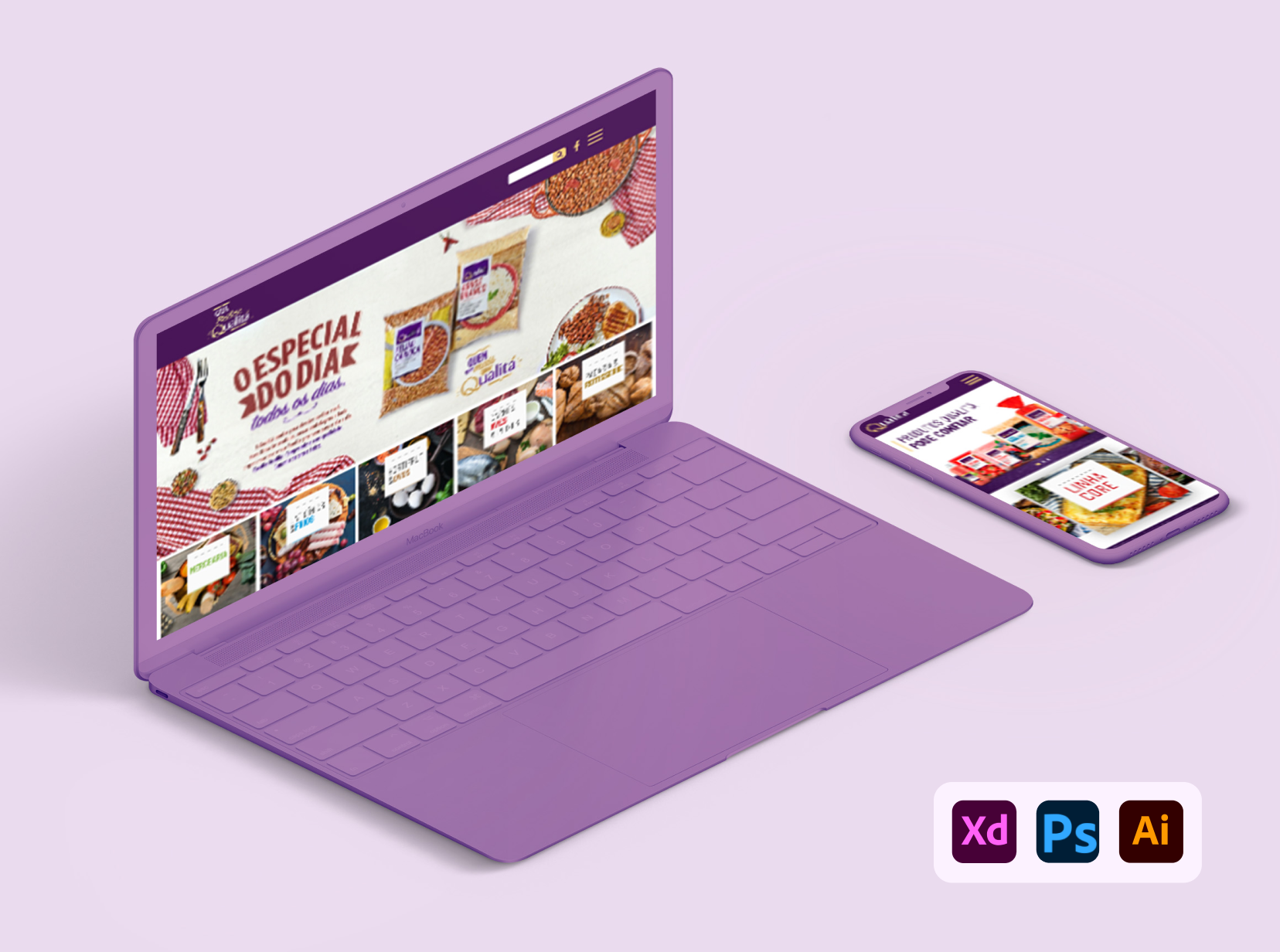
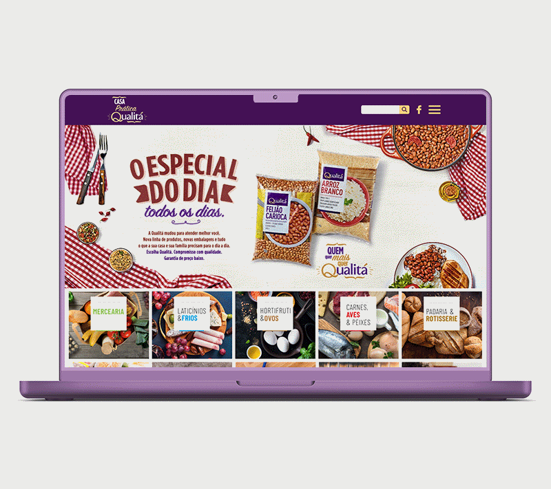
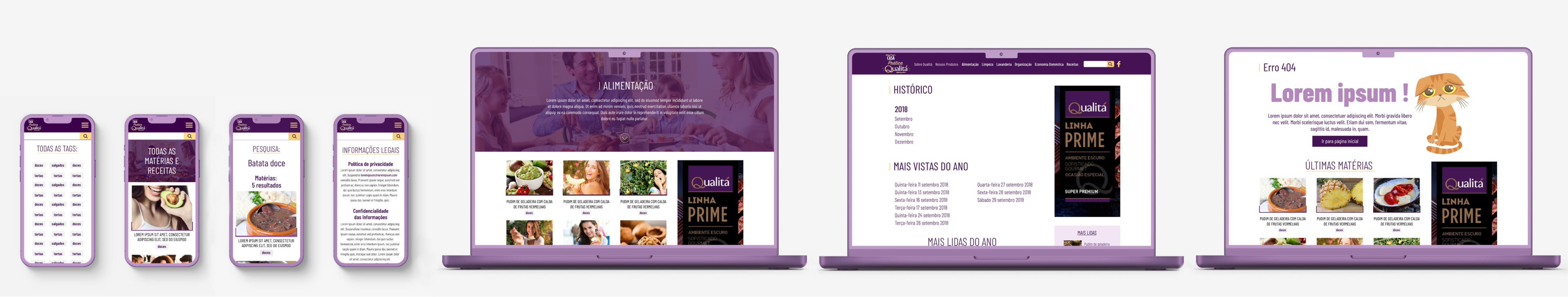
Home Page Design with Visual Emphasis
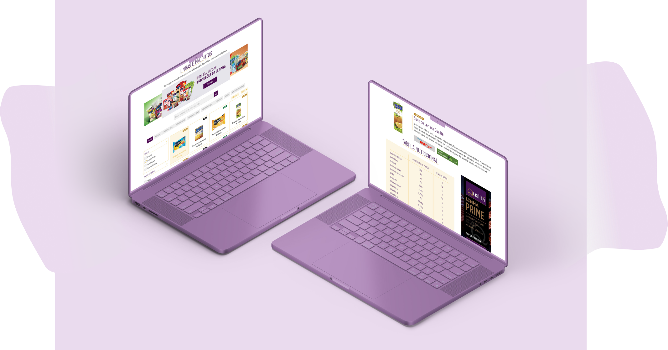
In terms of the home page, we focused on visually striking elements. A generous space was allocated in thehero section for showcasing Qualitá's product promotions. This was followed by categorized topics, using a variety of colors to bring dynamism to the area and leveraging imagery as background visuals.
Below, there's a section for videos, prominently featuring the brand's main institutional video, followed by thumbnails of other institutional videos embedded from the brand's YouTube channel. The visual context includes the use of textures to enhance the visual composition.
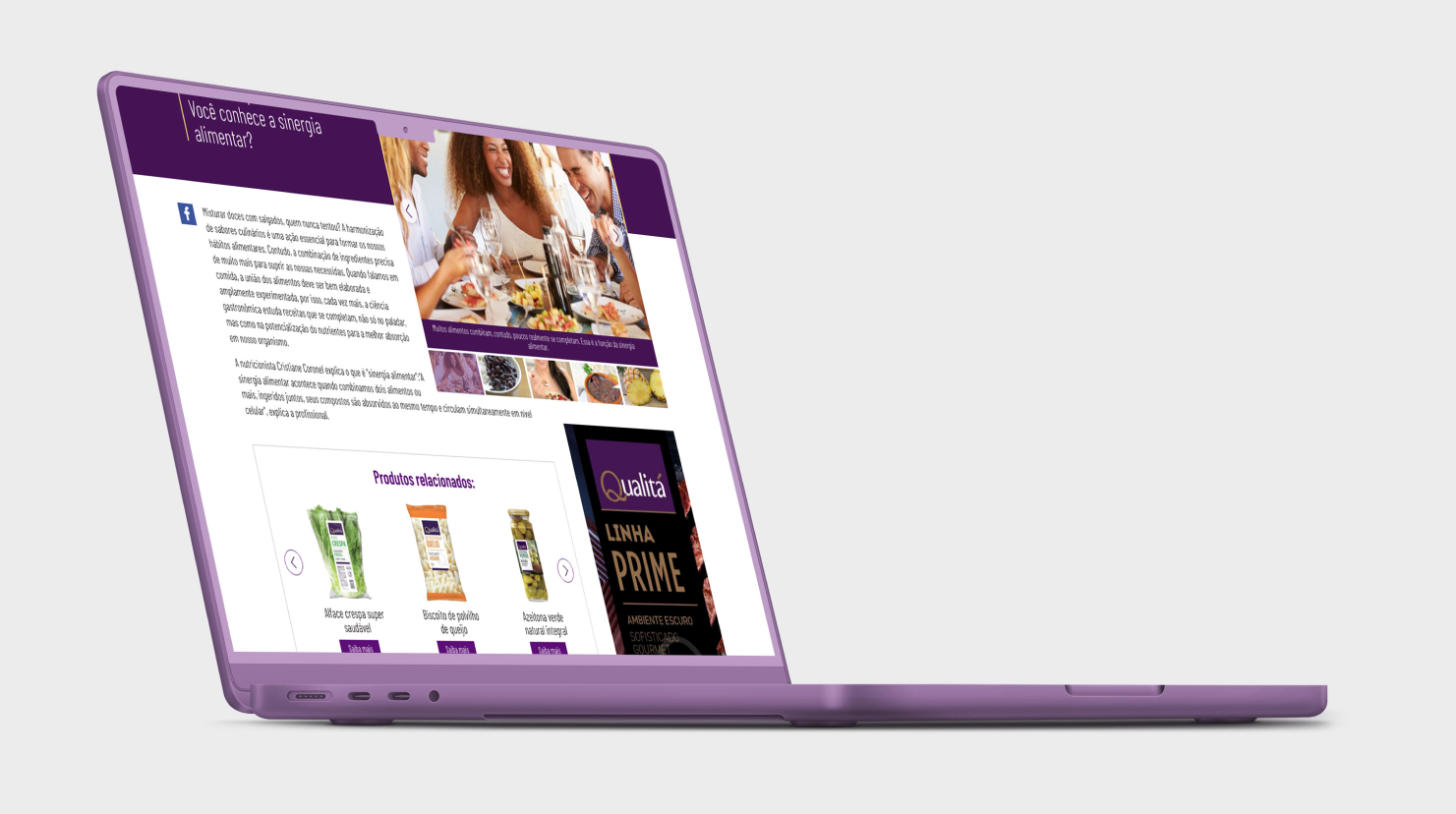
In the next section, an area was designed with a tab-like component allowing users to switch between recipes and articles, accompanied by a 'View More' button at the bottom. This is followed by a section with a banner that links to a specific page, which could be regularly updated through the CMS. Finally, there's a section featuring a carousel of institutional motion graphics gifs with thumbnails below, serving as a form of pagination.