September '19
| Organization | Team | Role |
| Cobasi | Brandpublishing | Junior UX/UI Designer |
People seeking informative content about pets
It has achieved 1,5 million/month organic visits (20/september/2021), being the biggest pet content platform in Brazil (by Similarweb).
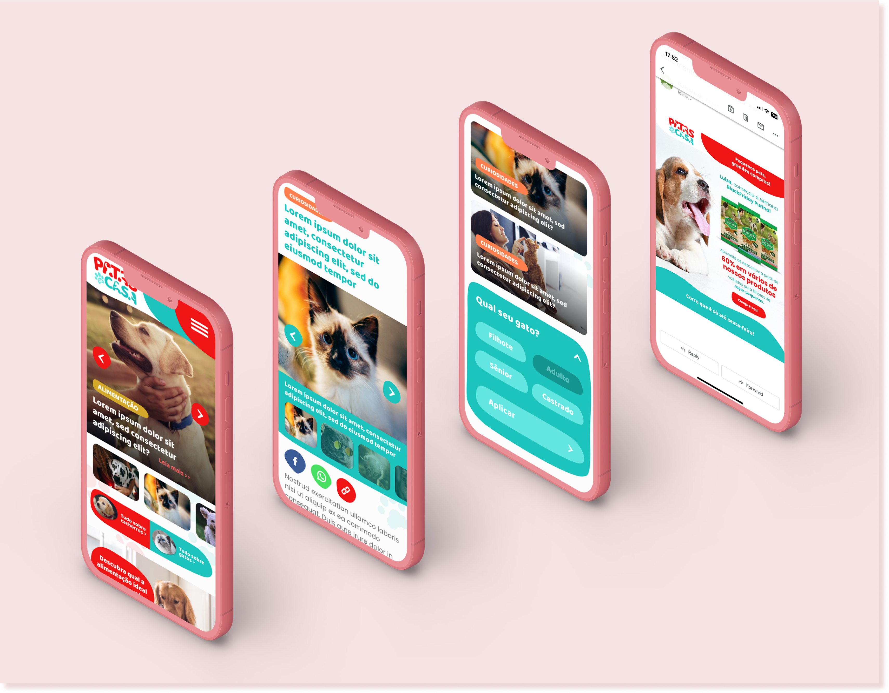
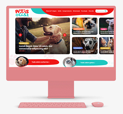
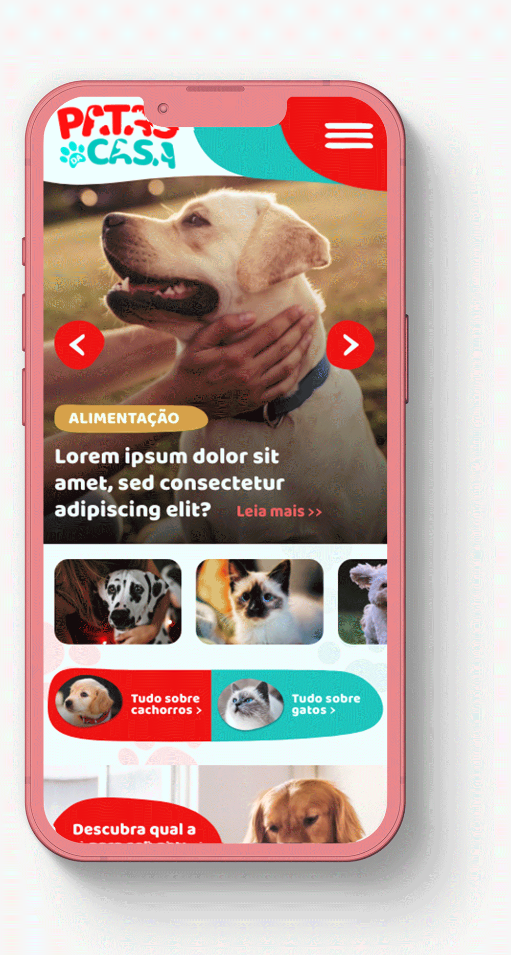
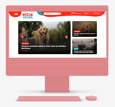
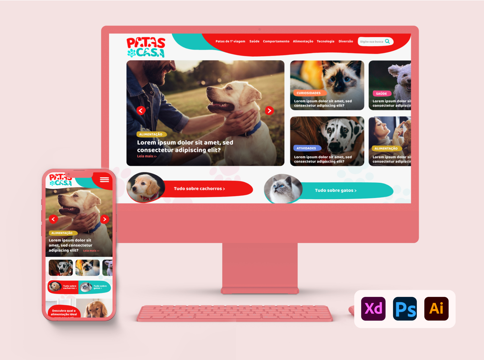
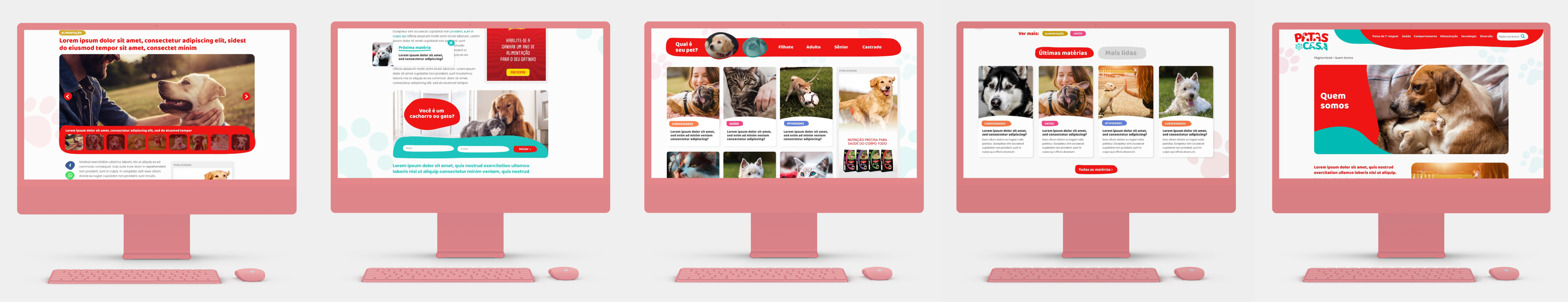
It's a portal that I designed for Purina, a brand under Nestlé's pet division. I initiated the project from its inception and developed it entirely, acting as the sole designer of the project while being supervised by Diego Lucas. This UX/UI venture had a particular focus on interface development. The project was considerable in scope due to its association with a highly reputable client. The objective was to establish an environment where individuals could access comprehensive information about their pets, quizzes, incorporating interactive elements to captivate users within the platform, as well as design an e-mail marketing templates for future marketing campaigns.
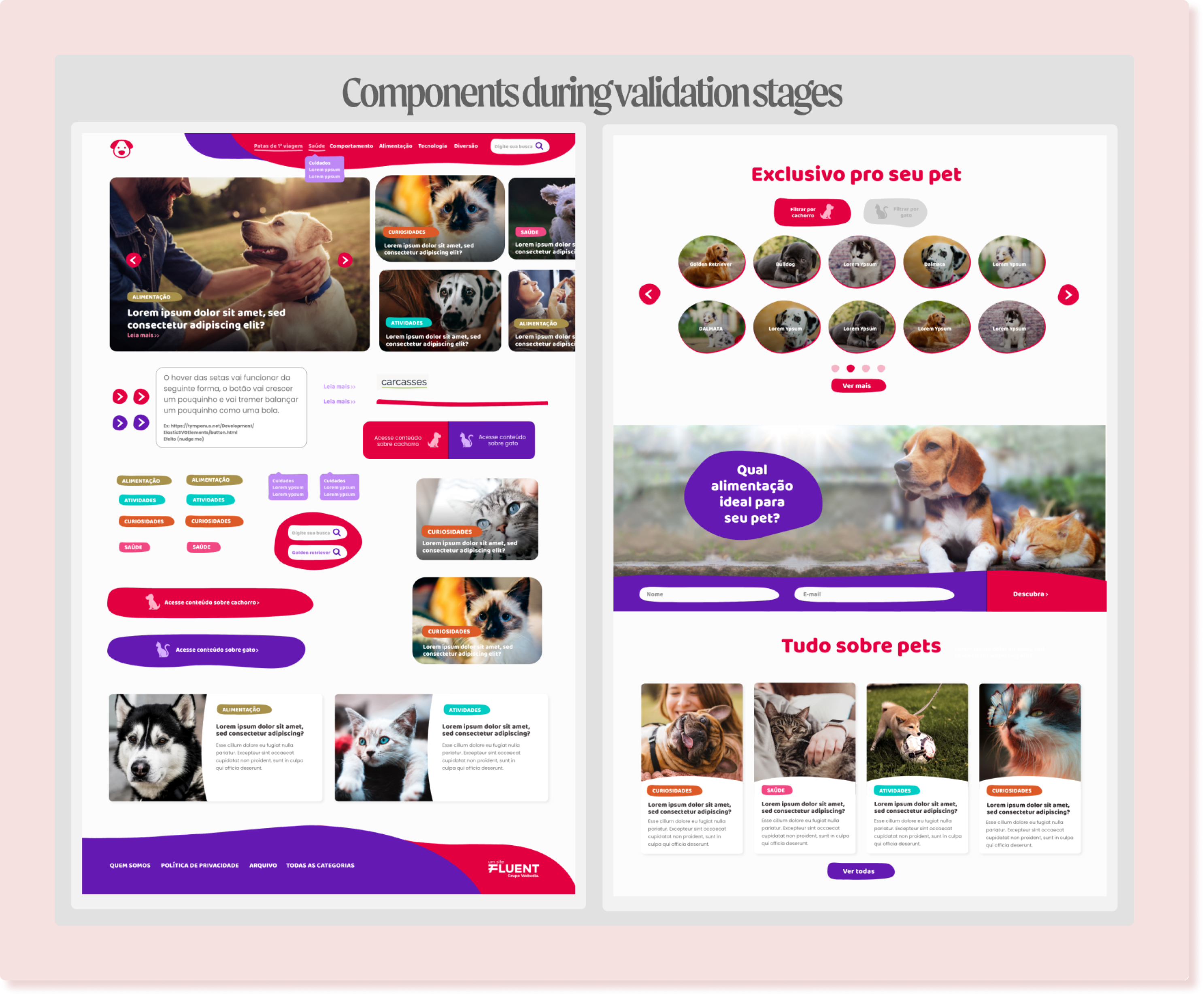
Since the project was developed in an agency, the client must aproove. So, the main concept was approved early on, requiring only a few minor adjustments As the portal was created concurrently with the visual identity within the creative team I was a part of, I also contributed to the decision-making process for graphic design elements creating , such as the logo. I immersed myself in the brand's culture and value proposition to better understand its philosophy, and then for the website, I focused on three essential pillars: typography, colors, and shapes.
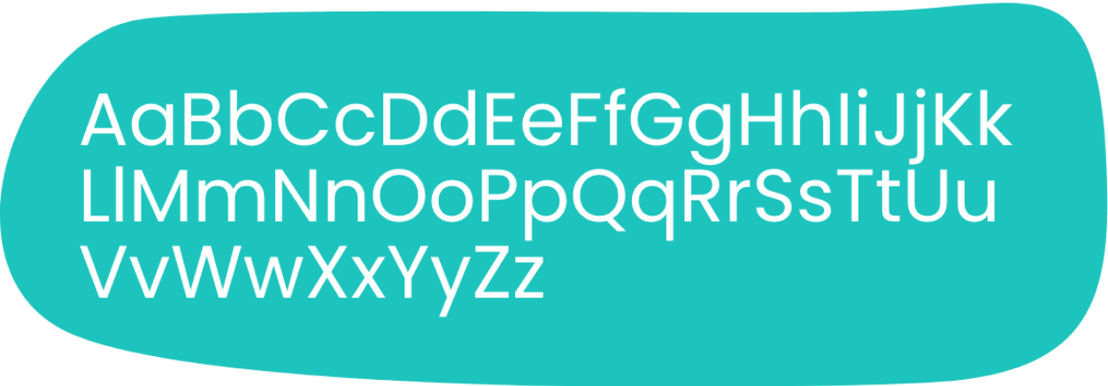
It played a vital role in this project, with the selection of two distinct fonts: Poppins for body text and Baloo Bhai for headings . The decision to use Poppins for the body text was driven by the need for a reader-friendly font, as the platform contained content with larger text blocks. Additionally, Baloo Bhai was chosen for headings, as its softer and rounded appearance conveyed a sense of comfort and ease, aligning well with the platform's visual identity.
Note: it's worth noting that both fonts were sourced from Google Fonts to ensure optimal performance of the portal.
As third pillar, the shapes played an important role. My intention was for this portal to have an appealing visual, so the shapes had a significant impact, as they exude a sense of fluidity and lightness. Additionally, the hover interactions contribute to enchantment by mimicking inflation or continuous movement, sometimes even a bit quirky, mirroring the behavior of pets.
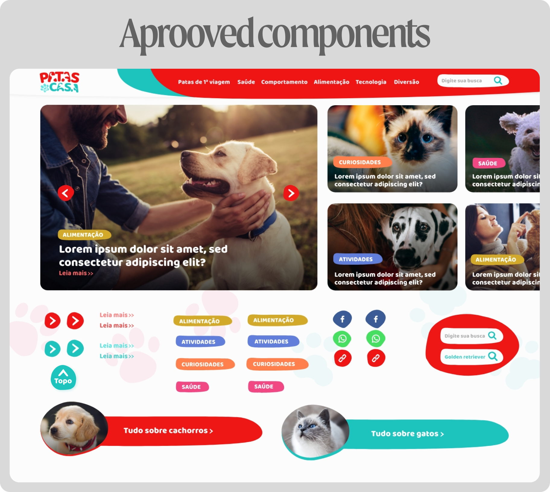
Last but certainly not least, a critical aspect I meticulously integrated into the site was SEO optimization. Given that it's a content platform, I aimed to ensure that articles would rank well in search results. I considered various factors, including the site's responsiveness to guarantee adaptation across different devices, thus delivering a consistent user experience on all screens. Visual hierarchy was balanced, adjusting font sizes and spacing to emphasize titles, subtitles, and crucial content sections. Breadcrumbs were implemented to assist search engines in comprehending the site's structure, along with helping users navigate. Legibility was prioritized, employing fonts at sizes conducive to easy reading, with proper spacing to allow comfort able reading. Lastly, I included social buttons to encourage users to share content across social media platforms.
This is a project that I'm proud to present, as all these elements were combined to create a user-friendly and charming environment. Pets evoke pleasant memories, and I aimed for users to experience the same sentiment upon entering the site, while also ensuring that the platform maintains a high level of quality. By having met the brand's expectation of becoming the largest pet content platform in Brazil, it reflects the culmination of my efforts. At the same time, it encompasses the accumulated knowledge I gained from designing other content platforms.